
Why is Mobile Responsive Design Such a Big Deal?
Let’s put aside for a moment the fact that Google’s April 2015 algorithm update is the reason all savvy companies are rushing to perfect a mobile-ready site. Have you thought about all the other reasons to have your website mobile-friendly from the get go? The goal is to display the same information that your site shows on a desktop, just on a tablet or on a smartphone that fits in the palm of your hand.
Mobile Internet Browsing Has Already Overtaken Desktop
We've already passed the tipping point: as of August 2014, more people access the internet through a mobile device than from a desktop computer. That's according to comScore, a leading cross-platform measurement company that precisely measures audiences and consumer behavior. And inbound marketing giant HubSpot agrees: 37% of consumers are more likely to make a purchase on a mobile-optimized site, while a staggering 39% of companies have not yet optimized their site for mobile visitors. This alone should be enough to convince you that having a functional mobile website design is essential.
27% of consumers will leave a site if it is not mobile-optimized. Which means if content is the way you’re bringing people in, you may risk losing them well before conversion is even a possibility.
- HubSpot Marketing Statistics
What Does Mobile Responsive Design Look Like?
A great looking mobile-ready website displays all the same information you'd see if accessing the site from a desktop, just in a new layout that makes more sense for the smaller screen of a tablet or laptop. Visitors should be able to easily see and read your content no matter what device they're using, without having to zoom in or out of the frame to read it.
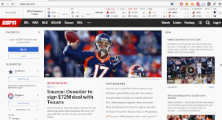
Take a look at this GIF of ESPN's website. The full-size site would still look good on a huge HDTV (they've got a ton of content!). As the browser window becomes smaller, the layout shifts to a format that looks good on a tablet, and then to a format that makes sense for smartphones. All the same information is there; it's just been rearranged to meet the needs of different screen sizes on different devices.
What Makes a Successful Mobile Responsive Design?
There are a few key things every mobile-optimized website needs to address. Visitors should be able to see your content easily without having to zoom in or out of the frame to read it. Also, adding sharing buttons should be standard, so visitors can share your content with others. This allows for visitor to help bring in more traffic to your website and potentially attract leads and increase sales. Images should be at the same resolution as they would be on a desktop monitor.
Here's what Google itself has to say about mobile responsive websites:
"We're boosting the ranking of mobile-friendly pages on mobile search results. . . . where text is readable without tapping or zooming, tap targets are spaced appropriately, and the page avoids unplayable content or horizontal scrolling."
How Can I Tell if My Site is Mobile-Friendly?
The good news is that Google considers mobile-friendliness to be a black-or-white issue -- that is to say, a site is either mobile responsive or it is not. You can't be "a little bit" mobile friendly, at least not to Google.
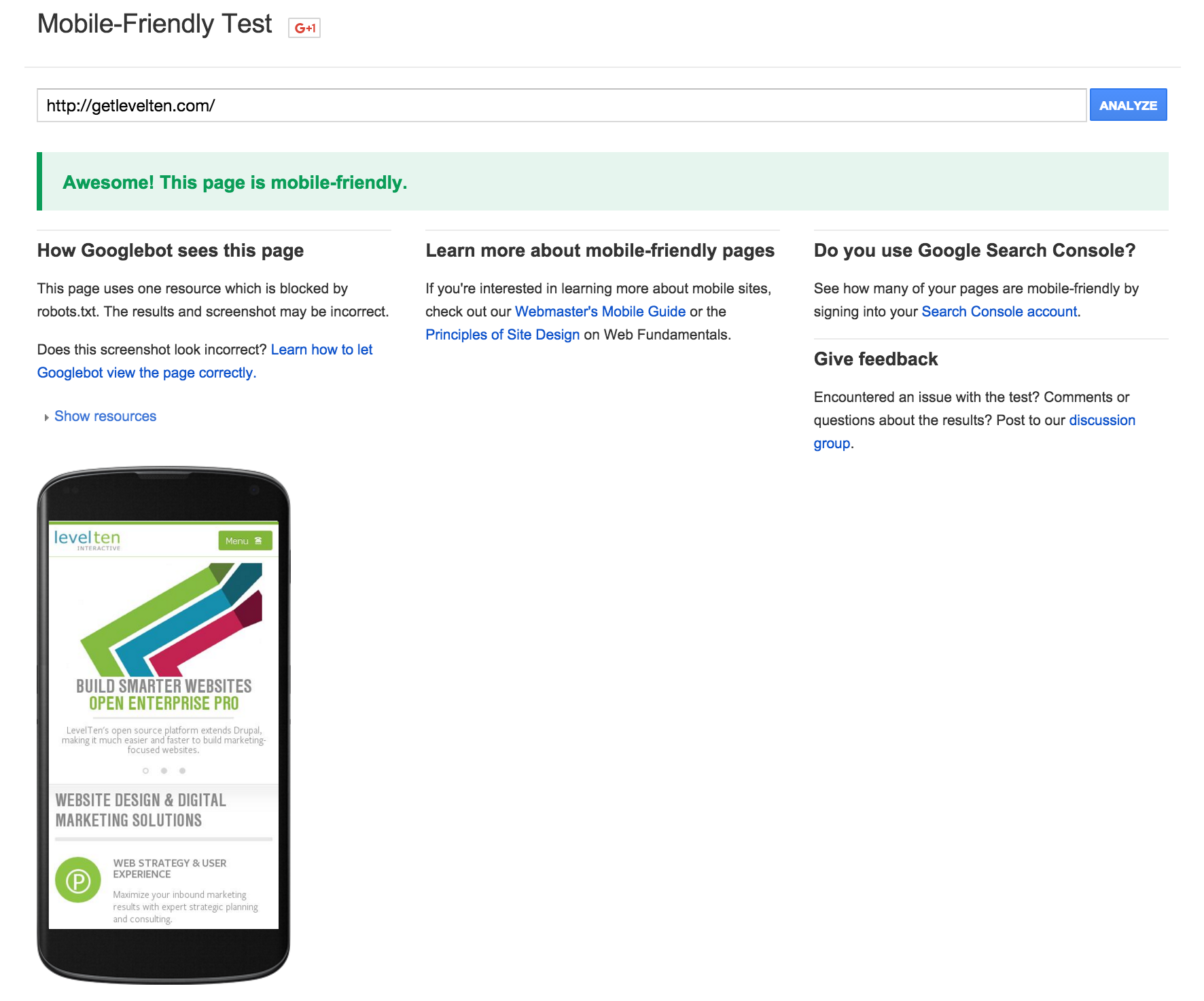
There are plenty of tools online that will crawl your site and come back to you with mobile responsive recommendations. A good place to start is Google's "Mobile-Friendly Test," which quickly assess whether or not your site meets the mobile responsive standards. Here's how our site fared:
How Do I Get a Mobile Responsive Design?
If you have a typical WordPress site, it's actually really simple to implement a slick responsive design. You just need to make sure that your WordPress theme is mobile responsive, and plenty of the free ones are. (One caveat: some themes are more thorough than others, so be sure to do plenty of testing on different devices and browsers to make sure you're looking good on every platform.)
If you have a more complicated website, you may need to enlist your developer's help to make sure your site's theme looks good on every device. At LevelTen, we usually design and develop big enterprise-level Drupal websites, so we've made sure that our Drupal distribution automatically rearranges the layout for the best viewing experience on any device.
Having a mobile-friendly website should be a key part of a company website redesign strategy in order to practice inbound marketing successfully. It will also help you rank well on search engines, as Google favors sites that deliver a smooth viewing experience across screen sizes. However, this can't happen if website visitors leave because the website is too hard to navigate on today's 5- to 6-inch mobile screens. It is now a mobile-first Internet, so remember to check your websites for mobile responsiveness and you'll continue to attract visitors.

