Is Your Site Design 2012 Compliant?
I recently heard someone on TV say, “I’m a woman of the tens .…” Ha, I had never thought about it but I guess what else would you call this decade?
I am starting off my third year of the tens with a bang, as the new web designer for Level Ten Interactive. As I settle in with my brand new colleagues in this brand new year, I’ve been reflecting on my goals for my client work at Level Ten. I’ve decided one of my top priorities is to make our clients’ sites look “of the tens.” But what does it mean to be “of the tens?”
I’ve come up with five web design trends that are differentiating new, hip sites from those of the 2000s.
1. Good Use of Typography
The use of beautiful typography can take a good site and make it great. To use type most effectively, a designer must strike a balance between type readability and using type as a design element itself. With the most popular browsers supporting the @font-face function, the use of design-focused typography is becoming easier and more popular.
Examples of sites that use typography effectively and beautifully:
2. Large Background Images
Using large, interesting background images on pages that are not content-heavy is a great way to create a clean, visual-appealing site. Of course, the designer needs to be careful not to distract the user from the content of the site. But done correctly, large images can be an effective attention-grabber. Today’s most beautiful large image sites combine images with clean typography to communicate its message.
Examples of great sites that use large background images:
3. Iconography
Although small, icons can contribute in a big way to the overall look and feel of a website. Simple, clean icons can make the user-experience much more stimulating and visually appealing – not to mention they guide the user eye to particular content.
Here are some sites that use beautiful iconography in an effective way:
4. Responsive Web Design
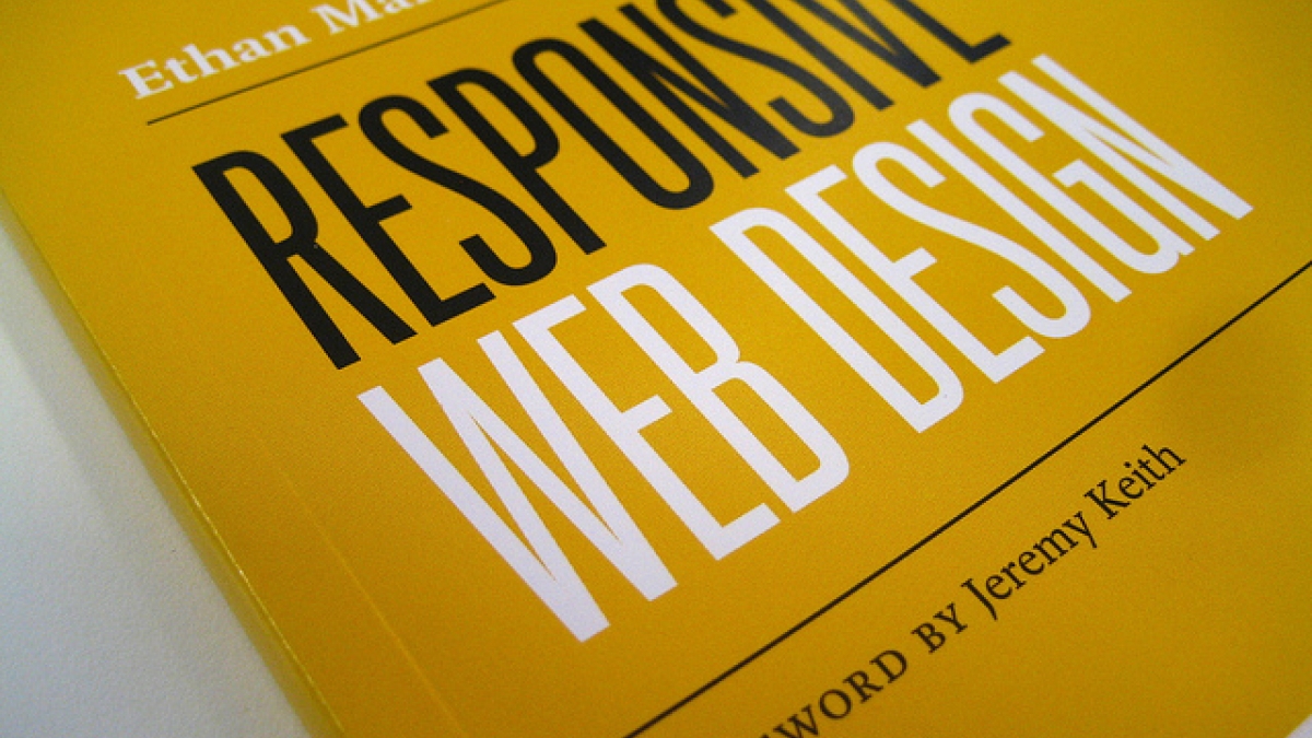
If there’s one thing we can say about “the tens,” it’s that the smart phone rules the world. That means it’s not enough to have a site that only looks great on a large screen, it also needs to be user-friendly and attractive on mobile devices. To keep up with the times, designers need to start considering alternative designs for a site as it appears on a phone or tablet.
For some examples of awesome responsive web designs, check out Media Queries.
5. Use of Social Media Icons
The appearance of social media icons on a site are a must for websites “of the tens.” Not only does the use of Facebook, Twitter, LinkedIn, YouTube and Google+ provide you the (FREE!) opportunity to engage your audience and promote your brand, linking to these sites from your website can actually improve your SEO.
Bottom line, whatever decade we’re in, good design is good for business. If your website is well designed and looks current, your audience is more likely to think the same is true of your business. Be a website “of the tens!”


