How to Create Kick-Ass CTAs for Every Page of Your Website
Your company’s website is more than just an online brochure, right?
Right?
Sure, your website needs to include all the brochure-type information that your users are expecting to find: business locations and hours, a complete list of your services, the industries you serve, and so on.
But truly effective marketing websites, what we at LevelTen call Results Oriented Websites, do much more than that. They take the user on a dynamic journey, educating them about the industry and even about their own problems. ROW sites gradually develop a relationship and build trust so that when the user is ready to buy, they’ll turn to you first.
The “dynamic” part of this journey means that the customer has ways to actively engage with you. Maybe they found a particular blog post incredibly useful, so they sign up for your email newsletter. Or maybe they really want to check out one of your ebooks, so they give you their email address for some permission-based marketing. If you’re doing it right, this becomes a carefully orchestrated dance, where both parties take turns getting to know each other and sharing information.
And it can’t happen without strong, strategic CTAs on every single page of your website.
A “Call To Action,” or CTA, defines what you want the user to do next. But you can’t just emblazon “Call Us Now!” in bright colors on your universal footer and call it a day. Truly effective CTAs take stock of where the potential customer is in their buying journey to gently guide them to the next step.
“When content effectively drives action, the next step of the sales process—an e-commerce company’s Products button, the B2B corporation’s White Paper Download form, or a nonprofit’s Donate link—is easy to find.”
-- David Meerman Scott, The New Rules of Marketing and PR
Here’s how to craft a truly kick-ass call to action for every single page of your website – and grow your business in the process.
1. Define Your User Goals
You should always know the answer to the question, “What do we want the user to do next?” It will be a different answer depending on what part of your site the visitor is hanging out on, and each page may have multiple user goals. Any action you want the user to take, whether it’s clicking a link to a related blog post or filling out a form, counts as a CTA. In general, though, CTAs fall into three broad categories, depending on what stage of the marketing funnel the user is in:
Looking for more information (Top of the Funnel): The user needs clear signposts so they can continue learning about the topics relevant to them.
Willing to begin a dialogue (Middle of the Funnel): The user trusts you enough to give you some information (typically an email address) in exchange for a free download (typically an ebook).
Ready to make a purchase (Bottom of the Funnel): The user is ready to buy, and wants to reach out to your company to continue the conversation offline. This is the coveted inbound lead!
2. Decide Which User Goals You Need on Each Page
Let's start with the home page. Your poor, overworked home page has a lot on its plate. It needs to make a great first impression, concisely explain how your products solve problems for your customers, and direct all your different target audiences to the information they’re looking for. Your home page needs plenty of TOFU CTAs, and very likely needs some MOFU and BOFU CTAs as well.
The fine folks at Growth Driven Design have a really great understanding of this. Here’s the first thing you see after the hero image on their home page:

Those are two great big CTAs right in the middle of the home page. Even if you don’t know anything about Growth Driven Design, the website helps you self-select which direction you need to go next: are you a marketer or an agency? The CTAs on this page efficiently direct each user to the information that is relevant to their needs.
As an internet marketing services company, Growth Driven Design has a long sales cycle and thus a very soft sell on their home page. This makes sense for them, but will not be the right choice for other industries. Here’s the website of a local plumbing company:
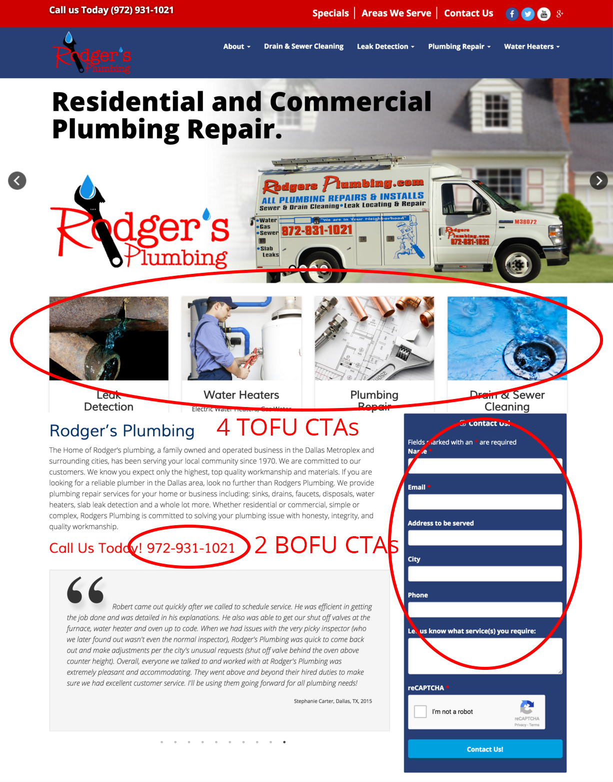
Because people who need a plumber tend to need that plumber rather urgently (just think back to the last time you were frantically Googling your local plumbers!), Rodger’s Plumbing has multiple BOFU CTAs on their home page. They also have four TOFU CTAs to help direct readers to the specific information they need. Plus, although they don’t have a specific CTA for any MOFU visitors, they do have trust-building testimonials right on the home page to begin developing a trust-based relationship with those users.
To summarize: it is essential that your home page gives plenty of TOFU CTAs to guide your visitors to the information they’re seeking. Depending on your industry, it may also be appropriate to offer MOFU CTAs (“Get a Free Quote,” “Request a Demo”) and BOFU CTAs (“Call us Now to Schedule an Appointment!”).
Now you’ll want to do the same thing for all the other pages on your site. Services pages are typically focused on efficiently directing people to more information. Blog posts need to interlink to all related blog posts, as well as direct people to free downloads and/or the best way to call you. It will all depend on the user goals for your particular target audiences.
3. Don’t Limit Yourself
Here’s something amazing: inbound marketing giant HubSpot recently discovered that, on average, end-of-post CTAs were responsible for just 6% of their blog posts’ total leads. By contrast, 83 to 93% of each post’s leads came from anchor text CTAs and internal link CTAs.
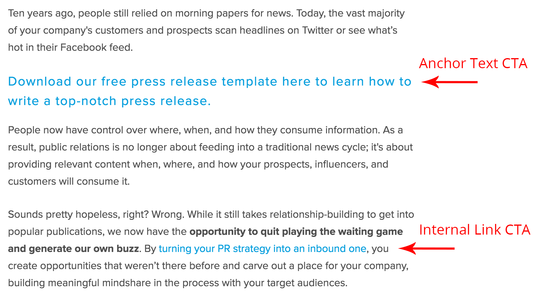
What’s the takeaway? Your CTAs absolutely do not have to be stuck at the bottom of each page. In fact, it’s much more effective to sprinkle CTAs throughout your website’s pages so they can reach your readers at the right moment.
By aligning your site’s CTAs with the goals of your users, all along the buying journey, you’ll be able to meet your site visitors’ needs much more effectively. So take a look at your current website: are you guiding viewers to the information they need? Are you making it easy for them to reach out to you? If not, it’s time to overhaul your Calls To Action – on every page of your website.