Six UI Trends I Seriously Dig in 2013
If I were to sum up the gestalt of 2013 Web Design so far, I would say it's all about being lean, engaging, and effective. A victorious design is one that feels fluid and simple (especially when the content may be full of layers of complexity) while also enabling the targeted behavior for users. With the growing use of mobile devices and changing SEO guidelines, the world of web design is facing daunting intellectual obstacles. Fortunately, there are plenty of UX masters who are creating solutions to these problems that are both effective and intriguing.
1. Parallax
Not new but gaining momentum and seriously cool, this design technique is where the background moves at a different rate from other elements on the page. The effect gives the design a three dimensional quality that really attracts the eye, but is only engaged when the user scrolls (the user controls the 'animation'). Why is this cool? It takes a boring thing like 'scrolling' and makes it fun and interesting. Bottom line, if you can engage a user to scroll, then they are seeing your content and more likely to respond to what you have to say. Check out this example: http://jason-kenny.com/
Con: This can be overdone quickly which results a site that makes your eyes hurt. This site on infographics really skirts the line for me - super fun animation but kind of has a lot going on.
2. Flat Design (sorta)
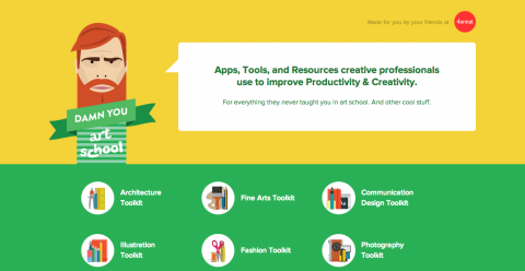
I know this is very trendy right now and there are a lot of strong feelings both for and against. For those unfamiliar, flat design is a 2D effect that relies on shapes and bold colors to create the effect of depth while also maintaining a clean & crisp aesthetic (in a word, minimal). Flat design became the topic of conversation with Apple's new iOS release, and some conversations were largely negative. Regardless of personal preference, what I really love about this technique is the constraints of the process and the resulting creativity. Flat design done well can be very interesting and effective in engaging a user.
Great example of flat design: http://www.damnyouartschool.com/
Also very interesting use of flat design here: http://lostworldsfairs.com/atlantis/
3. Less is More Interfacing
Web design is becoming more sophisticated and part of that is providing subtle interactions to enhance delight in new and unexpected ways. Take tabs for instance. It's been commonplace to make active tabs a different color than inactive tabs but to give hovered tabs a distinctive color. On Google Chrome, the hovered tab has a faint glow that follows your cursor along the tab. On this popular web design podcast site, you can see a very subtle 'jump' on hovered items. This subtle sophistication is bleeding into how a site operates, such as the minimal site navigation. Again, lean, beautiful and interesting is the mantra.
4. Responsive Design Requests
Responsive Design has been a popular topic among the web design community for quite a while, but what’s trending currently is how popular it’s becoming among clients. Having a mobile presence is no longer the concern of just mega-brands. The consumer market is becoming more and more mobile and businesses (and nonprofits) are seeing the need to adapt. Responsive design is one solution that is becoming more and more popular. The aspect I love about this (and several of the trends I'm spotlighting) is that it is focusing on solving a large scale issue: mobile access is a unique experience/opportunity that is growing. The internet is changing and web design solutions have to be leaner and savvier to keep up. While there are still a lot of complications with responsive design to consider, it allows organizations to be thoughtful in how to engage users who are on the go.
5. Single Page Design
Don't fear the scroll. With Google's changing SEO guidelines page content is of utmost importance. The direction of SEO is slowly but surely being pushed toward an internet where every page tells a story specific to the user's need and that particular website's solution. Finding a way to keep content together in a cohesive story is a plus. With the growing popularity of tablets, users enjoy the interactivity that scrolling engages and this is catching on with web design. This PR company site is an example of single page layout (also some good parallax going on here).
6. Non-geometric Design
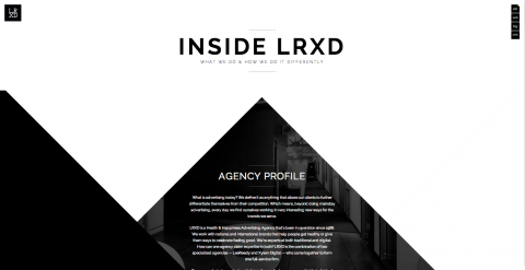
Like many of the others here, this type of design can get cheezy quick, but when done well you have a very unique experience. Take LRXD's site for instance.
This is a site where a completely unexpected layout is implemented in a beautiful and compelling way. The uniqueness of the structure adds to the uniqueness aspect of their brand.
Got any web design trends that you are loving? Leave us a comment below!


