
Testing Responsive Websites: Tools That Will Help Devs
If you have ever needed to test a responsive website, it's more than likely you have used Xcode if you are using a Mac Computer to test for iPhone and iPad compatibility.
Today, there are many different smartphones and tablets besides the iPhone and iPad and those who access your responsive website. Tedious as it is, there's nothing worse than finding out your website is not working on small devices besides a web browser. Here are 2 programs that will allow you to test and view the websites you wish to see on different devices.
Viewport resizer- responsive design bookmarklet
This FREE tool is more of an extension/bookmark for your browser. It's compatible with Chrome, Firefox, Opera Browser, and Safari. The minimal requirements for this tool to work are having online connection, JavaScript enabled, and test page must be running inside the frames.
Key Freatures:
- Fully customizable
- Manually toggle by click (portrait/landscape)
- Viewport animation
- Visual Preview of device metrics
- Print support for Chrome and Safari and many more.
Screenshots of the types of devices that can be tested:
Default Tools: 
Smartphones: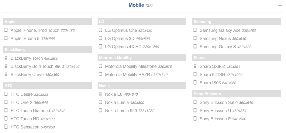
Tablets: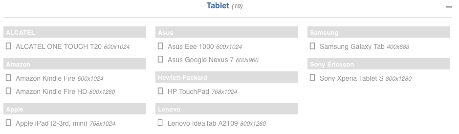
Widescreen, HDTVs: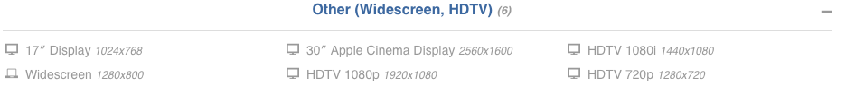
Of course, you may not need to test for all these different devices, but it is nice to have options and the best part is that it's free.
AdoBe Creative Cloud: Edge Inspect CC
Yes, this software does cost money, but you can always get a free 30 day trial to test it out. Apart from downloading it to your computer, there is also a Google Chrome browser extension, and a mobile app for iOS, Android, and Kindle Fire. The only draw back to this is that it limits your devices to those running on iOS, Android, and the Kindle Fire.
Some key features are:
- Synchronized Browsing and Refreshing- All mobile and tablets have to be connected wirelessly using a code generated by the Edge Inspect on the Chrome Extension or Software. Browsing the website through your computer you wish to test will then go to the same website and page across all connected devices at the same time.
- Screenshots
- Cache Management
- Editing the code, etc.
Which programs/tools do you use to check for mobile and tablet responsiveness? Let me know in the comments below!

