UX Basics for User Profile Accounts
Currently I am developing out the user interface for an online community. Before getting started, I spent a lot of time on some of the most popular (and some not so popular) social community websites, and created a list of basic elements to include when developing out user profiles.


 What are some other best practices for user profile accounts?
1. Have a clear purpose.
- When you're developing out a community website make sure you have a clear purpose for what you are doing. Write down the purpose of this community and what steps you are going to take to accomplish it.
2. Plan for a successful user experience.
- Create a visual guide for the user interface, otherwise known as wireframing. Your planning stage is your most expressive and important stage of your project. Think of wireframes as a map - a visual representation that highlights the workflow relationship between pages and regions. Your map is like your safety net - if you get lost, you can refer to the map for direction.

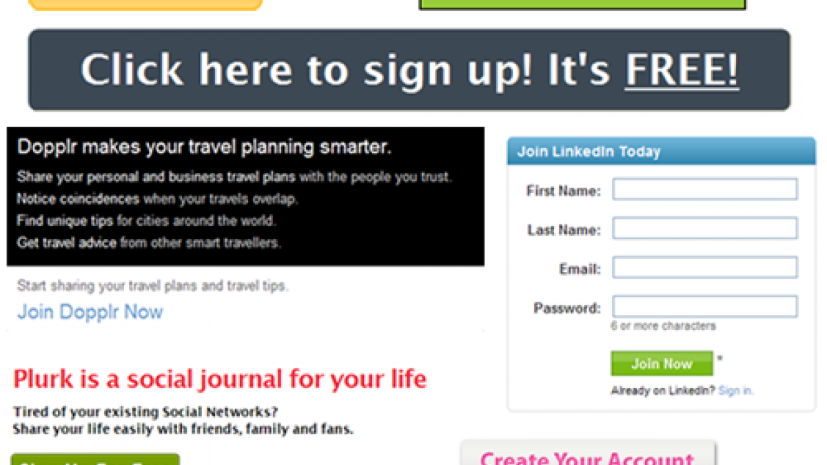
3. Creating a user account should be as easy as possible.
- Have a compelling message for what your site is about and why they should join.
- A JOIN button is far more visible than a link alone. The Join button needs to be the largest button on that page.
- An average online user registers on 15 sites per year. Keep yours as easy and as clean as the rest of them. Include the basics and leave the optional questions for later when they edit their profile. Name, email address, and password is about as simple as you make it.
- Now what? Tell the user what to expect next. Don't leave them guessing after they hit sign up. Will they receive an authorization email? Are they logged in? Let them know on the next webpage what happens next.

2. Registered users need a place to Login.
- Your homepage needs to have a place for users to login. Either that or have a "sign in" link located at the top right corner.
3. Edit and View Profile Unite.
- Design the user profile where edit and view functionality are closely tied together. Facebook and LinkedIn do an excellent job at this. Facebook uses ajax technology to allow users to edit sections of their profile without leaving the page. Talk about efficient and simple for the user! LinkedIn keeps the tabs next to one another keeping it easy for the user to switch back and forth without moving the mouse too far.

4. Standard Account & Profile Settings Location
- Best practices for account and profile settings is this: the Account Settings are on the right and Profile settings on the left. If you plan to target users who use other social networking sites, don't change the standard without having a compelling reason (and user testing) to do so.

5. Dashboard Confessional
- Dashboards are designed to be easy to read and display information of high-relevancy. It needs to be well organized and eganging to the user. The goal should be to take users to other pages within the community. For example, Dopplr displays a "journal" of recent activity with keywords and profiles linking to other pages. I can add a trip from my dashboard or ask or answer a city question. It's not overwhelming me with information unrelated to travel - rather it's keeping me up to date with travelers I know and making it easy for me to update my travel status. Easy does it.
 What are some other best practices for user profile accounts?