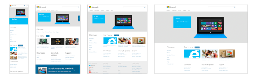
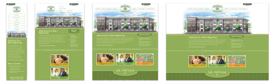
Ten Great Responsive Website Designs
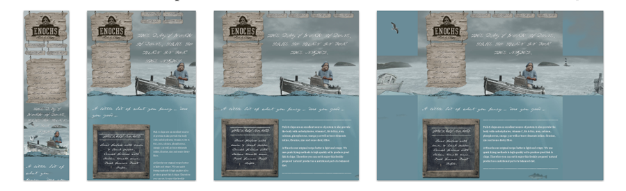
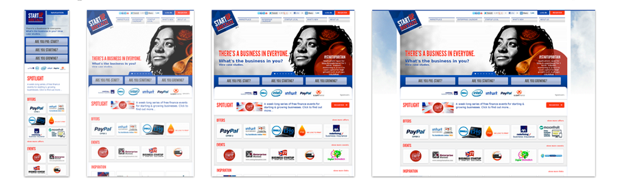
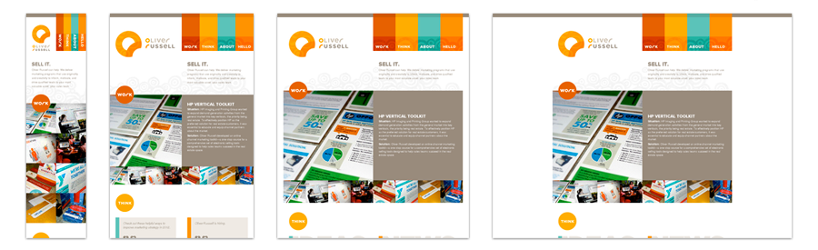
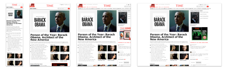
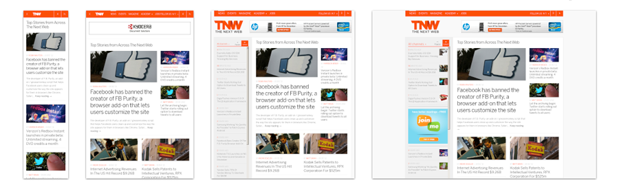
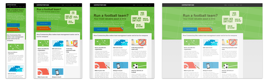
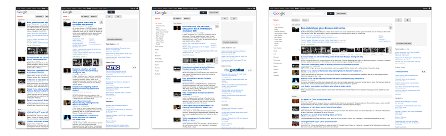
These days, if your site isn’t responsive, you are falling behind the curve. “Responsive design” is design in which content resizes automatically to fit a screen according to a shrinking and expanding browser. With mobile usage skyrocketing, responsive design is more important than ever — not just because it looks cool but for usability.
Since 2013 and beyond will focus heavily on mobile usability, I have decided to highlight some of the leaders in responsive design. Here are some of the most clever responsive designs I’ve seen. Make sure to go to their live sites and adjust your browser size to see the responsive design in action.
(Use the shortcut Ctrl + Shift + M in a Firefox browser to look at a site in different size screens too.)
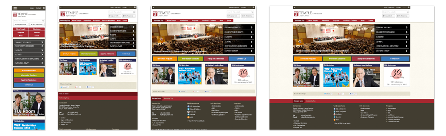
3. Temple University Japan Campus
For more responsive design inspiration, check out mediaqueri.es.
Is your website optimized for responsive design? Have any questions? Leave us a comment below!