Not Your Mother's Blog - 3 Features of a Modern Blog
You don’t hear much about mommy blogs these days. I’m sure there are still plenty out there – even in the age of parent over-sharing on Facebook – but I haven’t heard much about their evolution. After researching mommy blogs, I realize I probably haven’t heard much about these blogs because unlike the rest of the web, the design of these blogs has remained unchanging for years.
Since I will be a “mommy” any day now, I have started thinking about what a “mommy blog” would look like if done Gretchen-style. I searched “best mommy blog design” and found only unattractive templates. All of the mommy blog designs I see look dated and dull … This really got me thinking, what would MY mommy blog look like? Here are my thoughts on what a cool, modern mom’s blog (or any modern blog) should look like:
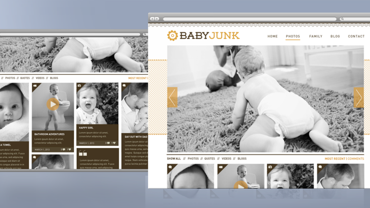
#1 MODERN GRAPHICS -- Forget the Flowers and Curly Qs
Clipart flowers and patterns make a site look so 2003. Just like moms who still embrace designer jeans and bikinis, it’s time to up the ante in the mommy blog design department. Stylish textures, cute logos/seals and simple, beautiful typography should dominate the new, modern mommy-blog.
#2 Responsive, Baby!
Just because a mommy blog is usually intended for only close friends and family, that’s no reason to skip responsiveness. Family and friends will be checking out the little cutie on their smart phone or tablet – possibly even more frequently than their desktop or laptop. For a truly modern blog, responsive design is a must.
#3 Magazine Format/Masonry
I know, I know – you’re sick of hearing about blogs using Pinterest-like masonry effects, but mommy blogs may be the perfect use-case. Using masonry to display all kinds of posts (photo, video, quotes, blogs, etc.) all in one area, will make it easier for the user to get an idea of what’s new with your little bundle of joy in just a glance. If the user wants to view only one type of post, they can use the filters above the masonry tiles.
Not only will this kind of layout make it easier for users of the blog to see what kind of content is available for viewing, it will make the parent-poster feel less pressure to always write a lengthy blog post – a feature perfect for a busy mom! Plus, let’s be honest, some people need to avoid getting too wordy because well … nobody cares about the details of your stomach bug and au gratin potato dinner success. Sometimes a photo or short video post is worth a thousand words.
I realize that friends and family are looking for photos of your kid – not a hot web design, but why not have it all? I think it’s time the mommy/personal blog got a makeover for 2013. Here’s my mommy blog mock-up. Will I actually create it? We’ll see – I’m not much for personal sharing online, but I’ve heard parenthood changes you …


