Some Things I Want In An E-Commerce Site
During the holidays I find myself shopping online more than in store. As much as I am thankful for the absence of crowds when shopping online, I also find that some sites are not offering me the experience that I desire. Sometimes, I get so frustrated looking for an item or a deal that I just give up for the day. So, in honor of my vexation toward some of these sites, I've decided to make a basic list of things I want in an e-commerce site.
- I Want to Feel Like I'm Shopping, But Without The Hassle
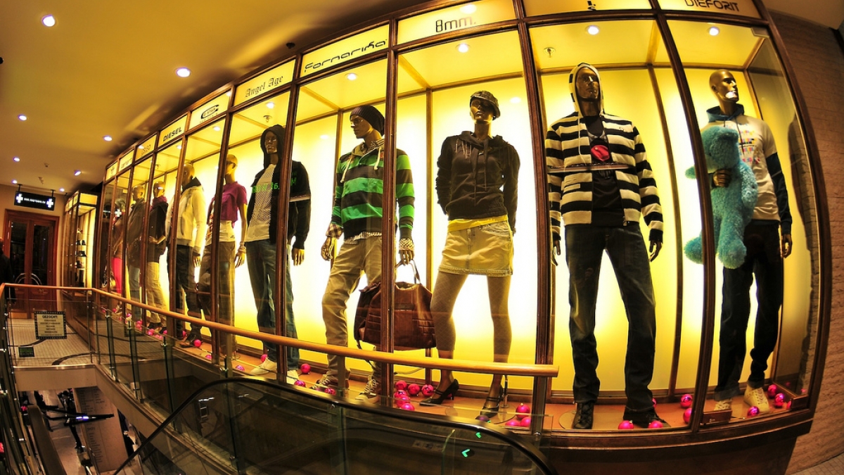
One thing that I love about shopping in store is the feeling that I'm discovering something new on my own. Sometimes shoppers are just "browsering" (my little term for online browsing). Give your visitors the option to explore by adding interesting designs and intriguing copy. Just be sure that your copy matches with terms you use in store (ie. Denim vs. Jeans). Allow visitors to have an experience, not just rely on a search box. Consider this step like merchandising for your website. Would you put that sweater in your store's front window? If not, then keep it off your homepage. - I Want Options
Of course, you'll want your site to display if an item comes in another color and which sizes are available online. People will turn to your website when a product isn't available in store, so make searching as simple as possible. Consider adding a zoom feature so that viewers who haven't seen the product in store can have a better idea of materials and texture. It may also be beneficial to offer items that are only available online. Online exclusives can be a real hit because they are "rare" and can get a good word of mouth reputation. - I Want To Feel Like I'm Getting A Deal
Like it or not, people will go into your store to check out your product in person then see if they can get a better deal online. This technique is called "showrooming". It's easier for consumers to compare prices online since it only requires opening a new tab and running a search. Stay on top of good deals (shipping, sales, online codes, etc.) and excellent customer service both in store and online. Be aware that disgruntled customers will turn to the web to leave nasty comments about bad experiences. Make ease, availability, and reliability your winning factors. - I Don't Want To Feel Like My Time Was Wasted
Make navigation as simple as possible. Having categories like "Casual" in the main navigation tab might confuse someone who is trying to quickly find a dress. It's better to have the category "Dresses" in your main nav and then allow the user to filter by Casual, Formal, Workwear, etc. One popular refinement is "Filter By Price". Viewing items classified by price really makes finding deals a breeze. Another way to save your users time is to add infinite scrolling for products so that he or she won't have to keep clicking the "Next Page" button. Thoughtful planning and wireframing is the best way to save time for your user. Just keep it simple, if you get confused by your site, you can be sure that your user will too. - I Want To Know That My Payment Is Secure
This is a no brainer, right? Wrong. Be extra sure that transactions on your site are secure, and provide a statement to that effect. Do not slack off when it comes to your consumer's money. They are trusting your business and they deserve a secure checkout. Make sure you set up security certificates. Drupal's Secure Site module is a great tool to add to your site. Have your system send out immediate receipts to the buyer's email address. Online tracking also helps put a consumer's mind at ease when it comes to shipping.
What are some grievances you have with e-commerce sites? Is there something that you always like to see when shopping online?
Photo credit: Tetra Pak

