eBay's New Look!
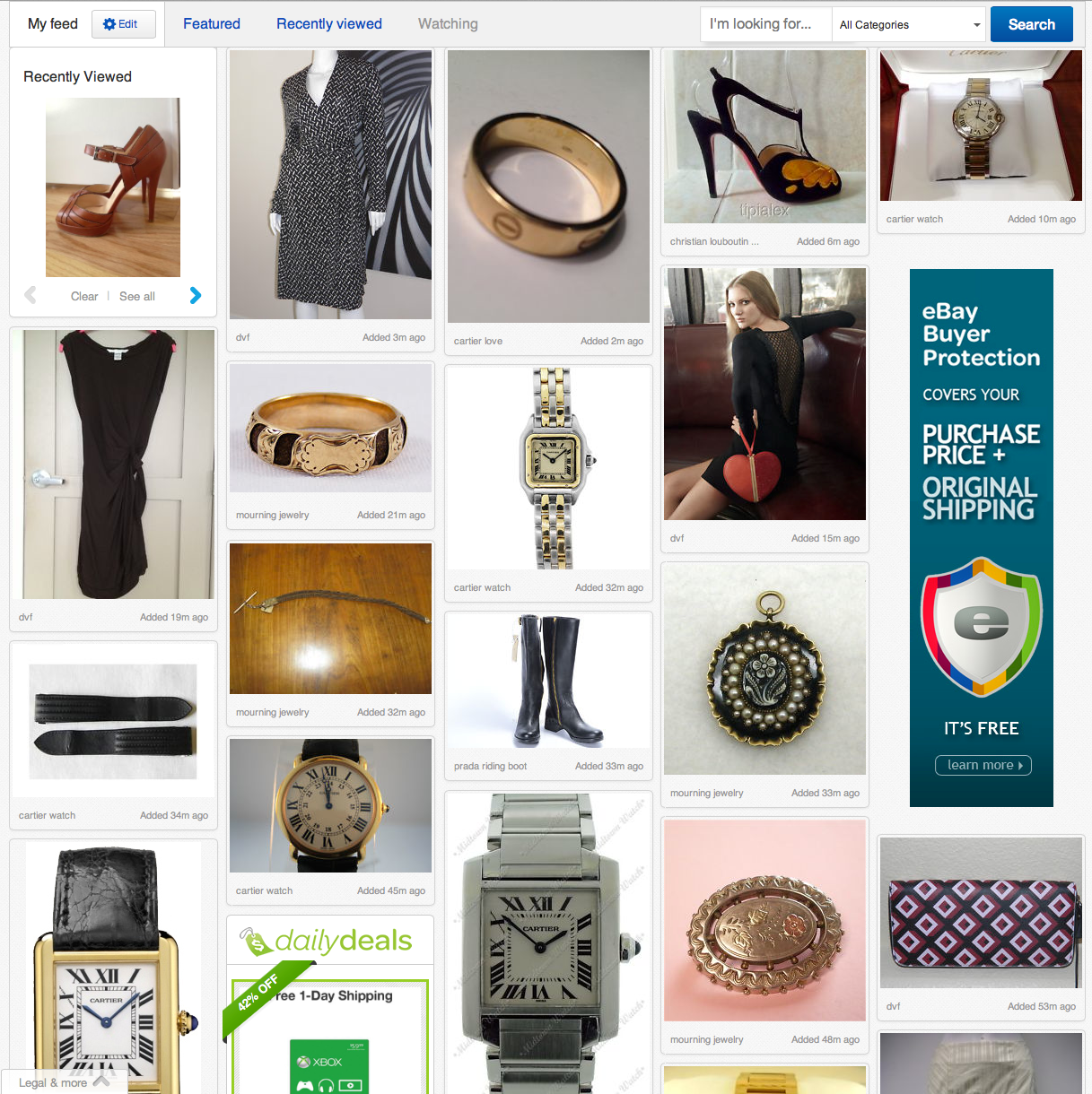
Offering a "new, personalized way to connect with the things that you love", eBay's redesign takes a page from the Pinterest playbook and adopts a shiny, new Masonry layout. Why would they risk changing a user experience that many loyal eBay community members have learned to love?
For one thing, Pinterest users spend almost as much time on site as YouTube users. EBay knows that the more time users are scrolling through images on their site, the greater the chance that they'll find something they can't live without.
While eBay spent years perfecting site search and alerts, they know functionality and usability aren't enough to keep users on their site. This latest enhancement promotes the aesthetics of interaction, using involvement and serendipity - the art of making an unsought finding - to attract and engage shoppers.
The new layout transforms eBay from a second-hand auction site with thousands of products to a curated boutique with items selected just for the user. The products look better in the new display which could translate to a higher percieved value of those products.
"We're delivering a cleaner, contemporary look and feel; a more intuitive, convenient way to browse, decide and buy -- both globally and locally; and a new personal way to curate your own shopping experience and discover items perfect for you," eBay President Devin Wenig said in an online letter.
The new features will be rolled out in the coming weeks in the U.S., followed by a global launch in the coming months, Wenig said.
The redesign also coincides with the launch of an app for same day delivery service.


