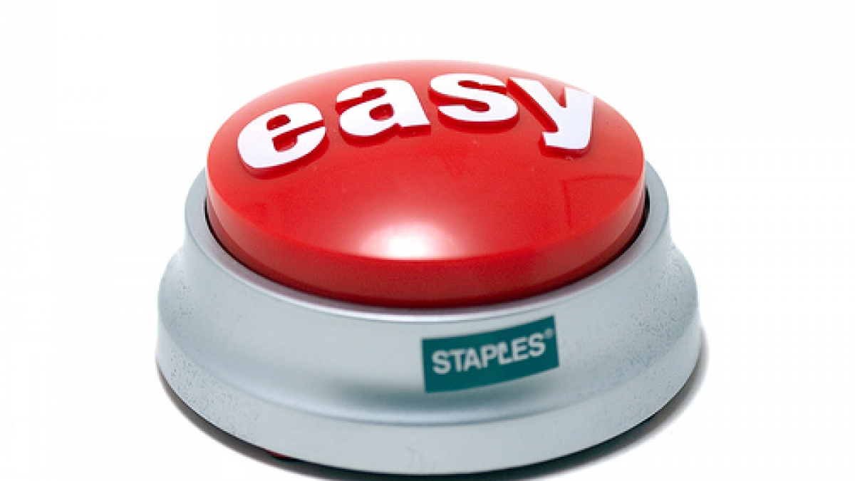
One of the things that always gets my gander up when I get comps and mockups back from designers is when there are buttons in places that links should be. For whatever reason many designers/UI people really like buttons and put them all over the place. There are pretty defined guidelines for when to use buttons and when to use links and these are often not followed.
The relatively recent introduction of the web, which was designed as hyper text (hence the ht in html) document, saw the rise of the link. Hyper text was designed to link to other relevant text which could link to other relevant text all over the web. Links are fundamental to the design of the web but were a foreign concept before it. With most desktop platforms and apps, pretty much everything is an action with a button. Very rarely if at all did we see a link that we would click. We clicked buttons. The web changed all that but many designers are still stuck in the button paradigm.
What is important here is the look of what is shown to an end user, not the html structure underneath it. For example, any decent themer can make a link look like a button or a button look like a link. What I'm talking about here is what the end user sees. It doesn't matter if it is a real button or a link that looks like a button; if it looks like a button, quacks like a button then it is a button. The reverse goes for a link as well. If it looks like a link, it is a link.
When to use a link
Links are primary used to "go somewhere." Any time someone is navigating to a new page on a website, use a link. Links should NEVER be used to change the state of an application. This means that clicking on a link should not add, change or delete any data on the backend (except for usage statistics which is different.) So, a delete action should not be a link, nor should a save action.
When to use a button
Buttons are primarily used to "do something" on a website. If the action is to created, edit, delete or anything else to some piece of information, use a button. A good rule of thumb is that if there are input fields for data there is a good change buttons should be used. If there are no input fields, don't use a button.
So why differentiate between these two? Users should know that clicking on a link is ALWAYS safe. They are just going somewhere. Even if there are fields that they have filled out on a page, if they click a link it shouldn't change anything. At the same time, they should realize that pressing buttons are much more important because they are actually doing something of importance.
So where does this get confusing?
One common place a I see this confused is when there is a request to have someone "go somewhere to do something." For example, there might be a place on a page to "Add a comment" which links to a page with a form to add a comment. Many people think "this is an action to do something, therefor it should be a button." However, they are wrong. What they are asking someone to do is go somewhere, not do something yet. Once on the commenting page the actual action to create the comment should be a button but the action to get to the page should be a link.
Another common place of confusion is the cancel action on a form. Should it be a button or a link? This is a debate that has raged back and form in the Drupal community and at large. Many people want the Submit and Cancel actions to look the same for consistency. Others argue that this is fundamentally a "go somewhere" action not a "do something" action and should therefor be a link. It could also be argued that on a multi step form a cancel action does change the state of the site and should therefor be a button. Drupal by and large has decided that cancel actions should be links, not buttons. Figuring out where a cancel action should send a user is much more difficult to answer and one that I've fought with my share of clients over.
Often times buttons are used in place of links where people are trying to draw attention or significance to a particular action. We see this quite often on sales landing pages that are trying to get you to commit one action. That action is highlighted as a button, even though often it is just a link to another page. By making this action a link, attention is drawn to the action and it is greatly emphasized. There is another reason though that marketing people like to use a single button and that is it gets people to commit more to their sales pitch. Imagine reading a sales pitch trying to get you to sign up for a newsletter or like something on facebook. If you click a link to go somewhere to fill it out, that is pretty normal. Clicking on a button to do the exact same think feels more final since you have done "some action" by clicking a button. It is much harder to back out of the process mentally. I'll grudgingly admit that this is one exception to the rules listed above that works because of the psychology. Technically it should be a link but buttons seem to get more conversions than simple links.
So the next time you are creating a wireframe, comp or mockup of a website, think about whether every action should be a button or a link. It makes a big difference.
Anyone else have any pet peeves regarding links and buttons?


