Health Design Challenge - A Closer Look at the Nightingale Design for Patient Health Records
The White House recently sponsored the Health Design Challenge in which competitors vied to redesign the confusing, unseemly patient health record. The entries were judged based on several criteria including ease of integration for physician, accessibility, and information density. First place design will be used to format VA health records; however, all design entries are open source. The winners were recently announced, with best overall design going to "Nightingale"
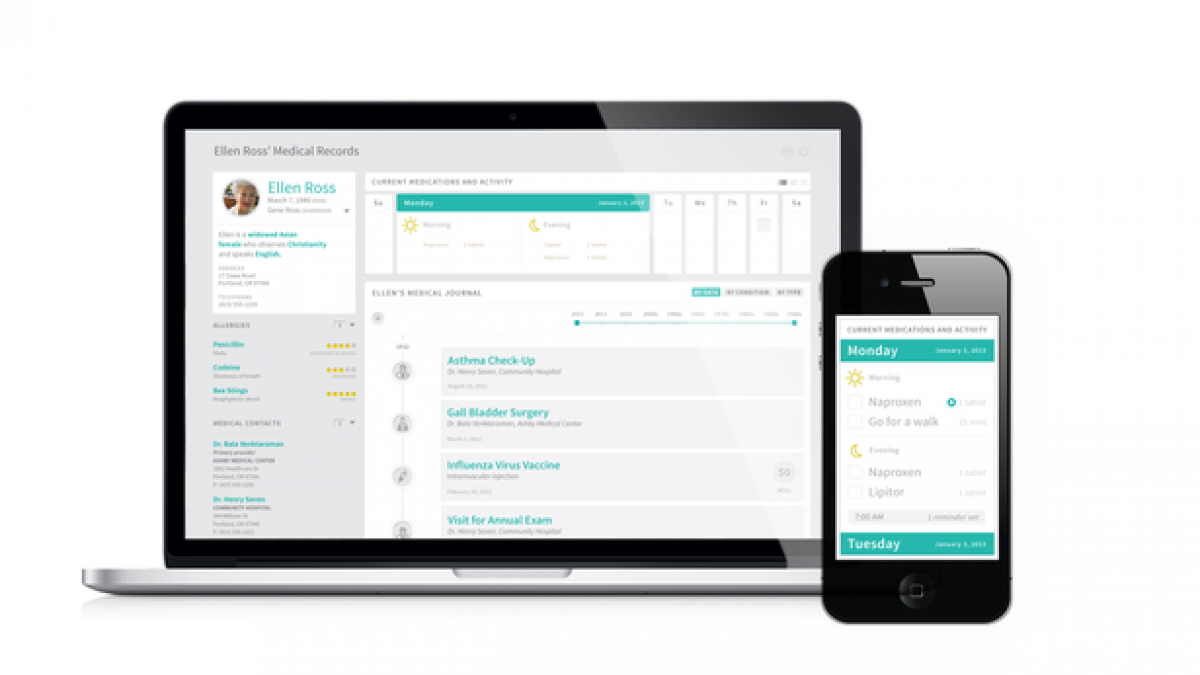
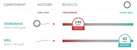
Nightingale features a clean, intuitive interface that is tailored specifically to each user. Built-in calendars and alarms are available to help keep patients on track with medicine dosage and schedule. With each new visit to your physician, Nightingale is designed to easily update and merge with past reports, tracking progress and trends. Data such as cholesterol numbers are simplified by being placed on a scale ranging from "concerning" to "doing well" in hopes of helping patients plan preventative steps for their health.
[caption align="center"] Sliding Scales Clarify Health Updates[/caption]
Nightingale is shown both on a laptop and a mobile device. Kudos to the team for staying on trend with responsive design. I've seen complaints online about the images having gray on gray text, making it difficult to read. That may be a valid argument, but I'd wait to see what it looks like in a browser before making a final judgement. Overall, the design seems comprehensive while remaining simplistic; however, I am not without my concerns for this mockup.
One of the major perks of the design, optimized for mobile, is also one of the drawbacks. The majority of people who need medicine reminders are typically older and may not have a smartphone, or know how to operate one. Has this design left room for the technology gap?
We also see in the pictures that the design looks great on computers and mobile devices, but what about printouts? There are some people who will never log into their account - might not even have a computer, but they may take a moment to glance at a nicely laid out page of information. After all, the issue here was that the printed electronic medial records were difficult for patients to understand, so it would make sense that the project would include a plan for a paper design as well.
What are your thoughts on the Nightingale design? Let us know in the comments!
Photo credit: Challenge.gov and TechCrunch

