11 Beautiful Flat Site Designs
If you have any interest in web and mobile technology and you don’t live under a rock, you’ve probably heard of the emerging “flat design” trend. Flat design started with Microsoft’s Windows 8 and has been followed recently by Apple’s iOS 7.
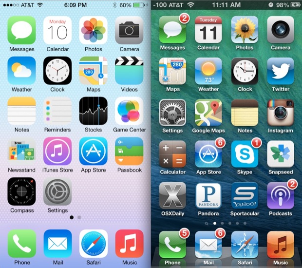
To understand the concept of flat design, let’s first examine skeuomorphic design. Skeuomorphic design is design that is intended to look realistic or three-dimensional. Skeuomorphic design utilizes bevels, drop shadows, gradients, textures and other “tricks” to make a design feel real. Flat design, on the other hand, scraps all effects used to create realism, and focuses on simplicity, readability and eliminating extraneous visuals that distract users.
The image below shows a side-by-side comparison of Apple's skeuomorphic iOS 6 (on the right) and its flat design iOS 7.
Like many, I find flat, simplistic design to be a breath of fresh air in this age of information overload. With much of our web surfing being done on smaller, mobile screens, keeping design simple is more important than ever.
Now let’s take a look at some beautifully designed flat sites:
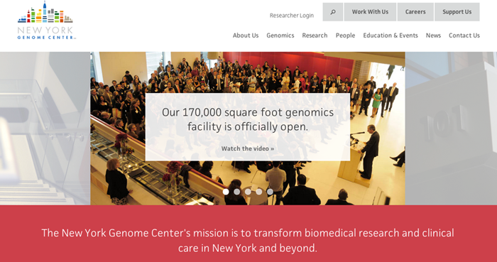
New York Genome Center
 \
\
National LGBT Museum

Team Geek

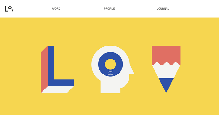
Lorenzo Verzini
Wistia

Snowbird

Bark Public Relations
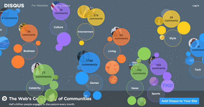
Disqus
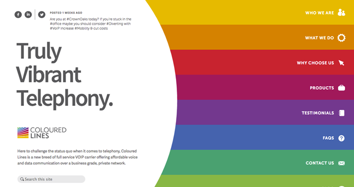
Coloured Lines
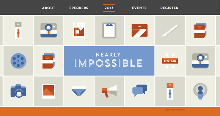
Nearly Impossible Conference
For a high quality web site design that delivers real results, check out our professional website design and development services.
