Typography for Web
When I start the design process with a new client, one of the first things I do is consider what typography the client’s new site will use. Will the the type be playful, modern or classic? Will the type be oversized in areas and used as a key visual element? How will I use a limited number of fonts to establish a visual hierarchy?
A site’s typography will communicate a mood while also playing a critical role in the overall design of the site. As such, font selection and type treatment must be done with much thought and consideration. I’ve identified the following key elements in successfully using type in a web design:
- Hierarchy: Using type with different treatments (variations in color, weight, size, contrast, etc.) and using varying typefaces can set headers, body text and links apart from one another, making the organization of material easier for the user to digest. Of course too much variation could make the design distracting and confusing, but done well, use of typography to create a hierarchy is key to a successful web design.
- Minimal Font Use: Sure, there are thousands of great web fonts at anyone's disposal, but using too many in one design will make it look disjointed and completely disorganized. Pick 2-3 fonts and use them consistently. This will make the design cohesive -- the selected typefaces should work together to create one consistent look and feel.
- Font Selection: Again, in the age of Google Fonts, Font Squirrel, Typekit, etc., designers have thousands of typefaces at their disposal, but selection of type shouldn’t just be made willy nilly … If a client’s site needs to feel young and hip, use a large, fun display font. If the client is conservative, try mixing some classic serif and sans-serif fonts into your typographical hierarchy. Obviously not every typeface is right for every client, so select carefully to ensure that type is meeting the design goals of the site. Also, and most importantly, make sure that the font is legible. Fancy or funky display fonts should be big enough to be easily read and never used in body copy.
- White Space: Give your typography some space to breathe. As with all design elements on a site, type loses its visual effectiveness if it is butted up against something else. If you are using large, header text, give it plenty of space so that it can stand alone as a design element.
- Line Spacing: Body text in a web design should have plenty of space between lines. Greater line spacing equals better readability. The line-spacing of body text should be slightly greater than the font size.
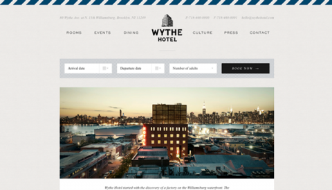
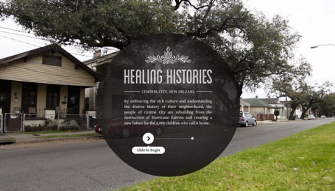
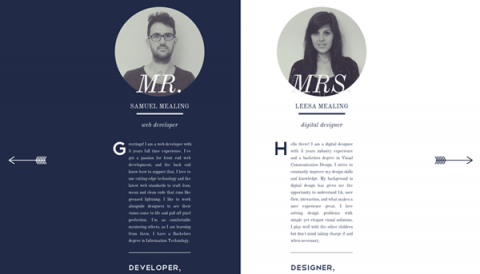
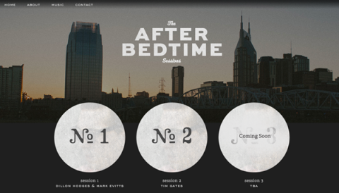
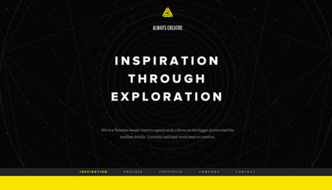
Here are some great examples of sites that use typography well:
Typography is key component in the design of a site. Type is not just there to communicate information -- it must be visually pleasing as well. Choosing the right fonts and using them in a nicely balanced mix will likely determine the success of a site’s design.
Do you have any other typography suggestions for websites? Any favorite sites to share? Please leave your comments below!
