Website Trends 2013: Large Typography
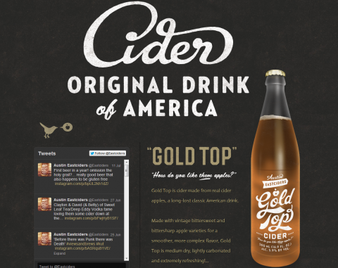
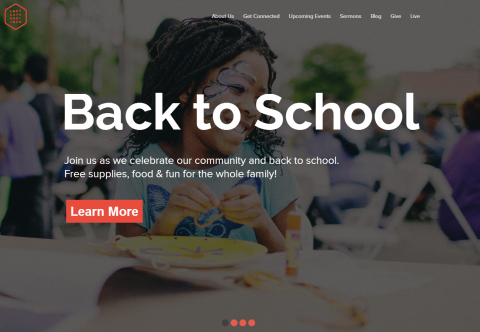
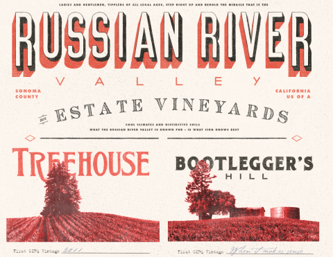
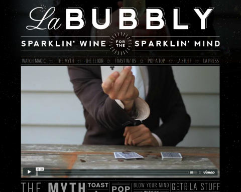
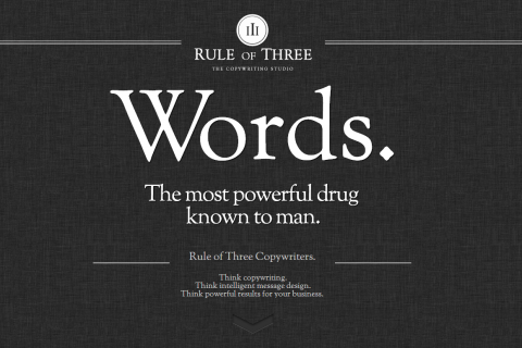
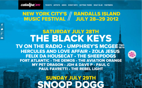
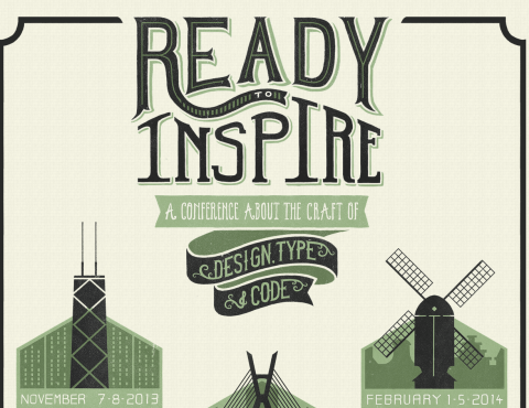
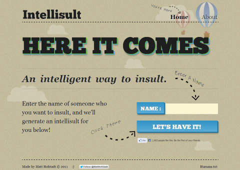
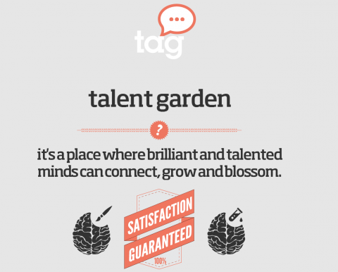
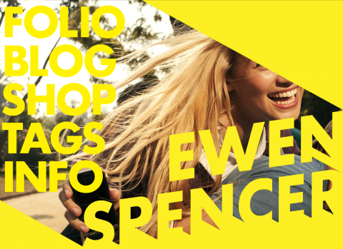
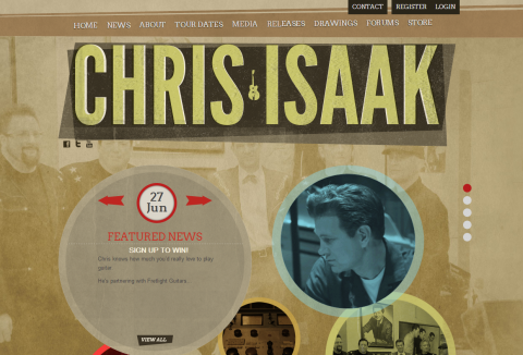
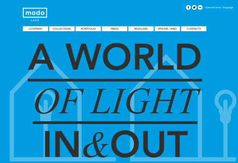
When it comes to minimal design, typography is a fun element to play with. The web is full of sites with beautiful typography that is used in creative ways. One trend taking place on the web is very large typography.
When done right, large typography can add to the brand and make a site's message more impactful. But, if formatted incorrectly, large type can seem overwhelming and just plain annoying. Look through this list of sites to draw inspiration from successful designs featuring large type.
How do you feel about the large type design? Are there any other sites with large type that you really like? Share your thoughts in the comments below!
