Five Principles of Visual Web Design
There are many factors that contribute to the effectiveness of a website – functionality, information architecture, messaging, marketing, but if you can get the following aspects of visual design right, you’re off to a great start.
1. Select the Right Color Palette
Color selection can make or break a design. Creating the right color palette for your site should be done carefully. If your corporate colors include several bright hues, use only dashes of the bright colors in combination with neutral tones for a more refined look. Keep in mind the meanings of colors across cultures, and make sure that your target audience will experience the colors of the site as you intended. Additionally, make sure that there is enough contrast between text and its background to be easily legible.
Here are some sites with beautiful color palettes:
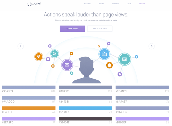
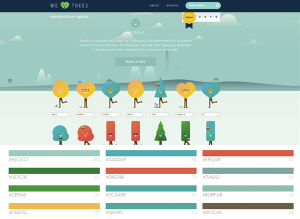
(color palette data courtesy of webcolordata.com)
2. Scrap the Clutter
Every organization with a web presence is trying to communicate certain important information to its visitors. If that messaging has to compete with too many visual elements, it gets lost. Keep the focus on important information by pairing key text with powerful images and refined design elements. Additionally, keep paragraphs to 5 to 6 sentences and include bulleted lists where appropriate – this makes the content more easily scannable. Research using heat maps shows that most users don’t read – they scan. Adjust your design accordingly.
3. Don’t Cheap Out on Photography
Put down the cell phone camera. I repeat, put down the cell phone camera. Your website is not the place for poor quality images. Beautiful, high-resolution photos are a requirement for a polished and professional looking site. If possible, hire a photographer to take professional shots. If hiring a photographer is not an option, use high quality stock photography. Don’t underestimate the effect photos have on the overall look of a site – quality photography is CRUCIAL.
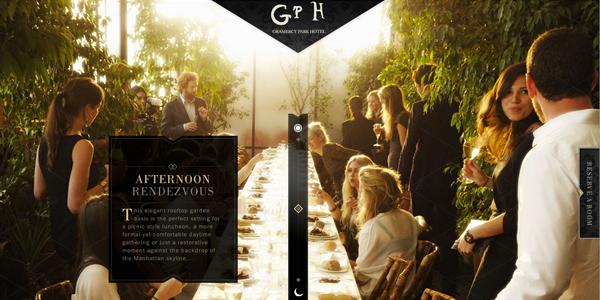
Here are some examples of sites with excellent photography:

4. Put Thought Into Photo Selection
Photo selection also plays a critical role in design success. Research has shown that people have a preference for looking at faces, so consider including some photos of people throughout your site. Photos of people will immediately draw the attention of your visitors by establishing an emotional connection. If using stock photography, avoid meaningless photos such as a handshake or other overly-used stock images. Focus on images of people showing positive emotion.
5. Make the Right Font Selection
Just as color and photo selection evoke an emotional response, font selection contributes to the overall feel of a site as well. Keep your design to one to three fonts – otherwise the design will start to look haphazard and busy. Of course there is an exception to every rule, but for most sites, using two or three fonts is sufficient to meet design goals.
Most importantly, your chosen fonts need to be easily readable. That means, just because you can go to fontsquirrel.com and find a really cool display font like this, you shouldn't use it for large blocks of copy that your audience needs to read and digest quickly.
Do you have any suggestions for visual design elements? Leave your comments below!