")
Does Mobile Website Design Matter? (Revisited)
Browsing through some of my older blog posts today, I couldn't help but laugh at this horrible excuse for a story about mobile design and its overall lack of any supporting fact links. In addition, looking at the length of the post, my style was probably a little more suited for a simple status update than worthy of the LevelTen Blog.
Somehow, I did also manage to create a video snipet centered around the same discussion, and it made me think about how things have changed since 2009 and how the current answer to that question is a resounding YES, mobile is a major factor in any new web project.
Just to show that I have progressed as a writer, producing at a 10th grade level now, I'm going to point out exactly why mobile is so important this time around. I'll even go so far as to actually reference external data.
Let's start by taking a look at the number of global smartphone shipments since 2010 and where projections are heading into 2016.

Those numbers are in MILLIONS so we're talking about continued sustained growth year after year. Think about it: if there are more individuals with smartphones, there are more folks hitting your website from those mobile devices. It's important to consider the desktop, but you can no longer focus your strategy around a full screen experience. I've spoken with companies that expect to see 50% of their traffic come from a mobile device this year and another that already has over 33% mobile or tablet traffic.
When considering mobile statistics, it's important to not be too narrow in your thinking. Sure, smartphones are all the rage but tablets are blazing a trail onto the scene and will continue to grab more and more market share. Take a look at the trends for tablets and how the market is really starting to segment there as well.
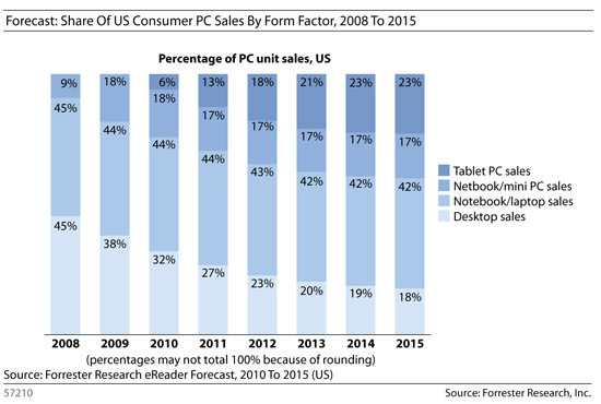
This year alone it is projected that there will be more tablets sold than desktop machines and it's only going to continue that way. Interesting to note, notebook and netbook sales numbers will hold about the same but it's the desktop machines that really take a hit.
Our lead designer, Gretchen, recently wrote a post about some great responsive web designs. For me, it's nice to see that more and more companies are starting to come around and really taking the mobile space seriously. The biggest challenge we see with helping our clients take that next step is cost. Simply put, a well done responsive design could easily double the cost of front-end design work. Then again, not being mobile design ready might cost a whole lot more!
Do you view websites more through a laptop/desktop or a mobile device? Do you agree that a responsive design is better? Leave us a comment below!
Photo Courtesy of Matt Cottam