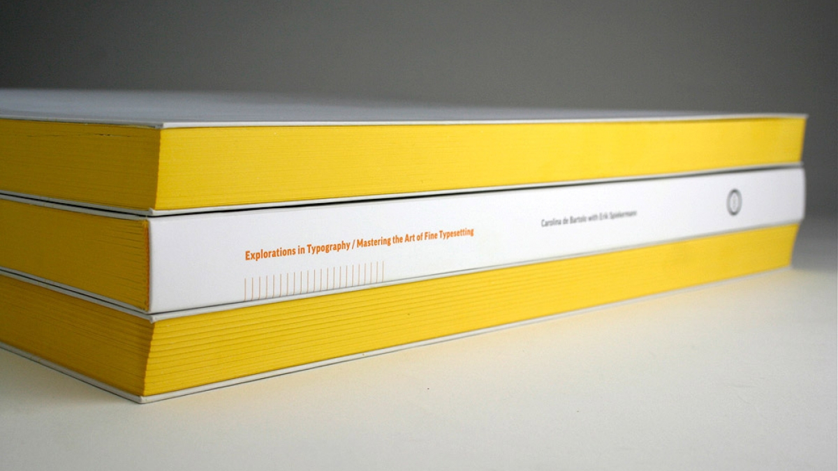
Exploring Typography Rules
I always feel a little intimidated when discussing typography with people who really know typography. Don't get me wrong, I know my way around old-school web-safe fonts and I have an innate aversion to Comic Sans, but when in the presence of a designer or typographer, I'll inevitably make an observation that causes them roll their eyes and sigh with the same disdain English teachers do when you end a sentence with a preposition. I know good typography when I see it, I just don't know all the rules.
That's why I love the book and web resource, Explorations in Typography: Mastering the Art of Fine Typesetting. This Visual Textbook for Intermediate to Advanced Typography is a vast collection of beautiful typesetting examples. On every page a brief article by Erik Spiekermann has been set in hundreds of different ways in hundreds of different typefaces, creating an extended visual taxonomy of typesetting that allows you to “learn by looking.”

The website lets you "learn by exploring" with different indents, exdents, leading, alignment, font types and sizes. It also contains the history of specific typefaces, examples of acceptable typeface combinations, and a handy glossary of terms so you know the difference between baselines, meanlines, and clotheslines.
With resources like this at your fingertips, there's simply no reason to feel lost in the typography world again! Go explore some fonts, learn some new design vocabulary, and create something amazing using your new typeface knowledge.

