Creating a Better UX with Icons
As sales and marketing begin to focus more on the consumer, web design shifts more focus to the user experience (UX). Whether you’d like to promote a specific action or draw attention to some information, icons can be an easy way to help users recognize and understand content and calls-to-action more quickly.
Adding Text
Icons can be particularly useful when paired with clear accompanying text. In a study of a Microsoft Office toolbar, once the important icons on the toolbar were labeled, “the toolbars were a big hit, and everyone at all skill levels started using them"1. Also, text labels remove any confusion as to the meaning of the icons and reduce the time that your users take in figuring out their next steps.
Keep It Basic
It’s clear that keeping it simple is the easiest way to keep your icons readable and easy to comprehend. This includes using basic, universal shapes and minimal styling or detail. A good example of clear icons from Shero Designs might include:
![]()
Follow Trends
It’s important that your icons are recognizable. For example, your user would expect that an icon that looks like a house would lead to the homepage, or a telephone would lead to a phone number. Stuff & Nonsense demonstrates how one icon shape can be used in many different ways, and how difficult that can be to understand. In one example, they discuss how the use of a plus sign (+) can be confusing. One one site, it indicated a drop-down menu; on the iOS platform, it generally means adding an event, note, or contact. Even the most simple icons can be confusing if you don't take into account the different usages.
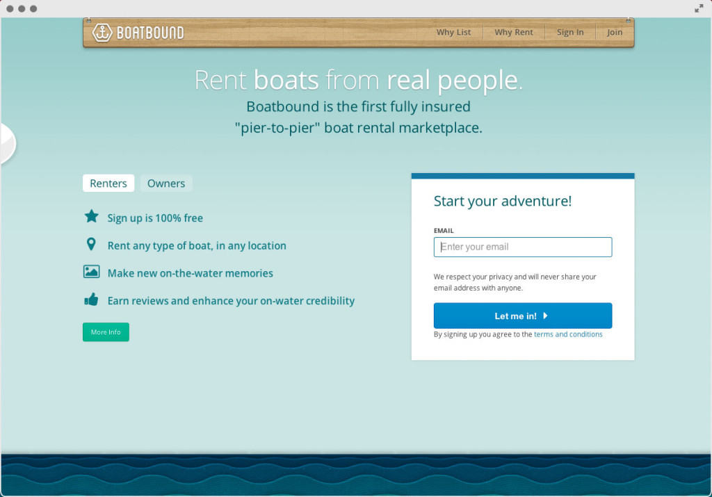
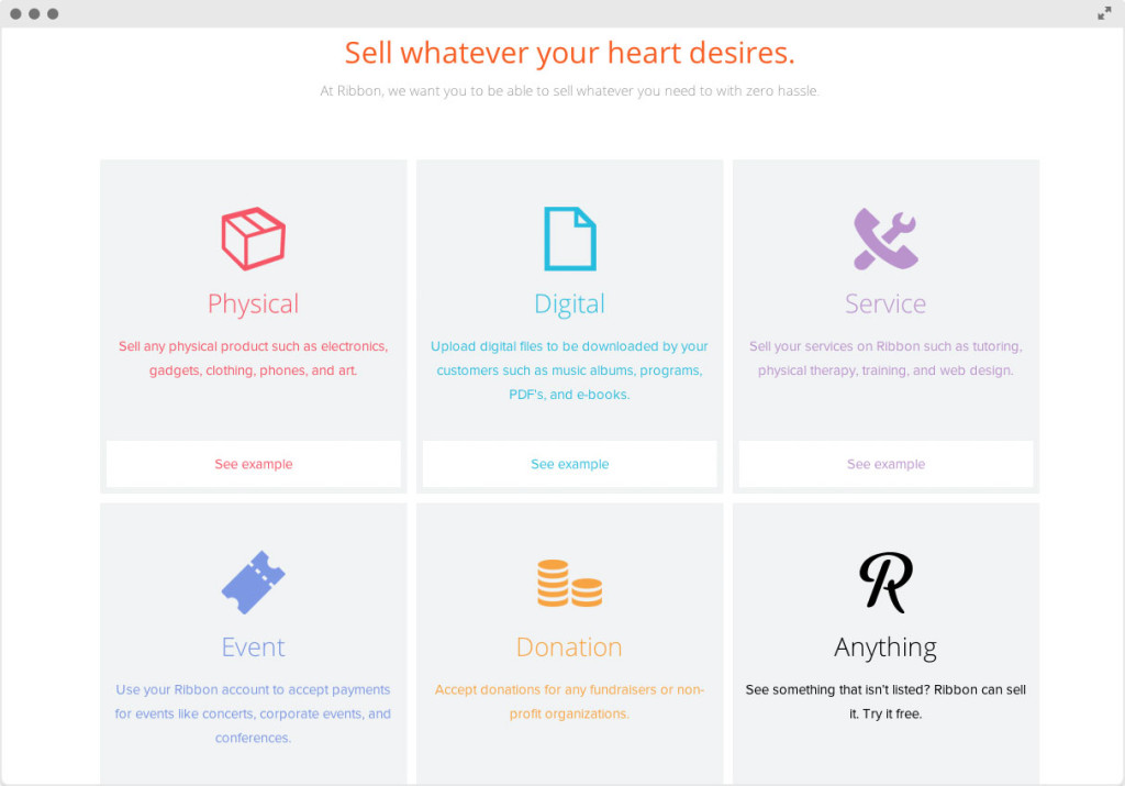
Some of our favorite examples of great icons include:


Boatbound and Ribbon found on PowderKeg
Sites like Fontello and Font Awesome provide easy-to-use resources to create icon fonts that you can use across your entire site! Even an excellent design can’t make up for an icon without a clear meaning. Keep it simple, label your icons, and help your user find exactly what they’re looking for in a more visually appealing manner.
Do you think icons make sites easier to understand, or more complicated? Comment below!

