How to Create the Best Featured Images for Blog Posts
Our blog's featured image is more important than we may realize. Everyone knows the phrase don't judge a book by its cover, and yet, we all catch ourselves doing it anyways. At first glance, your featured blog image is going to be what draws your reader in. It's also going to take up the majority of your above-the-fold content once your readers actually open your blog. As such, you're going to want to make sure you make a great impression.
If you're a blogger but not a designer, have no fear. Today, there are so many resources and tools available so that even non-designers can make beautifully crafted featured images. The featured image that I made for this blog post was created primarily with Canva, one of my favorite easy-to-use graphic design tools. You can check out all of its awesome features in my recent blog showcasing how to use Canva. However, in this post, I'm going to walk you through some simple tips and resources which will enable you to successfully attract your audience with your own featured images.
Don't Underestimate Stock Photos
Unless you have an in-house photographer or designer willing to make trendy vector images from scratch for every blog post, you're better off saving time and money with stock photos. Yes, some stock photos are known to be painfully cheesy, but you would be surprised at how many high quality, professional photos and vector images that are available for free commercial usage.
Here are some of my favorite free stock photo sites:
- Pixabay provides a comprehensive scope of images and vectors.
- Pexels is a great place to find new photos and new image sources since the site sources all of its own photos from a spread of other free stock photo sites.
- Freepik offers trendy vector and icon images.
- Unsplash is basically the source of all hipster, vintage images embodying that "art should be free because we're all young, wild, and free" way of life.
- Rawpixel is a service much like Pexels in that it provides high-quality photography, vectors, and even PSDs.
The Power of Overlays
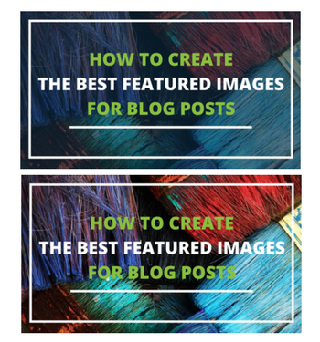
Don't you just hate when you pick a great background photo, but it distracts from the message you're trying to place on top of it? This is where overlays come into play. You would be surprised how much a colored background can help your message pop.
Here is an image of the featured image design with and without the dark blue overlay. As you can see, the message becomes much clearer with a transparent overlay.
Move up with Mockups
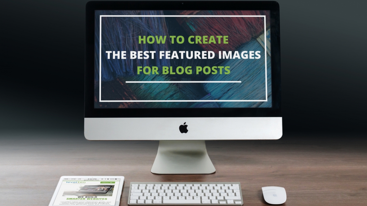
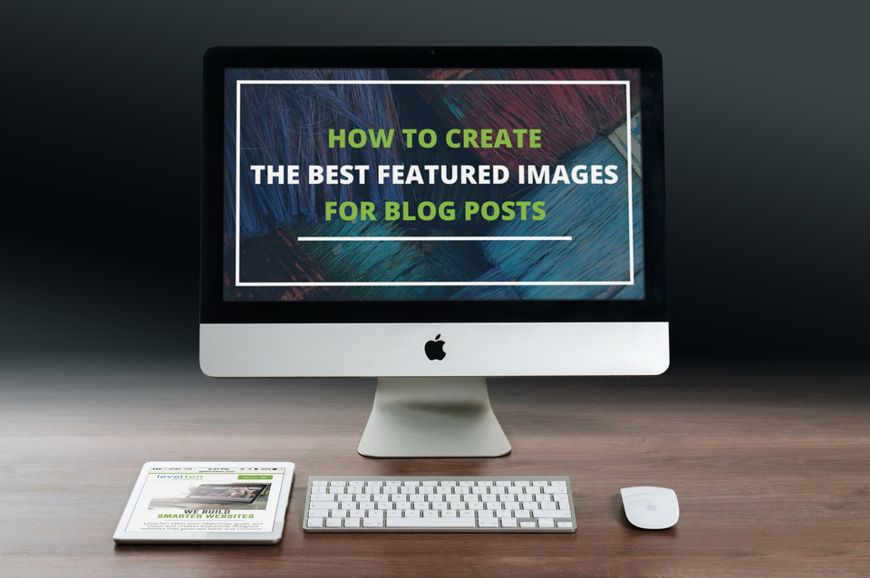
Here at LevelTen, we love to use Mockups. These are especially useful if you're in the tech industry. However, there are plenty of Mockup sites that offer templates for other industries including fashion and apparel, food and beverages, traditional media, etc.. Personally, I think these give your image a more personal and professional touch. You can upload an image, and the Mockup system will automatically place your image onto one of their predetermined displays. You can use any image whether it be a screenshot from your website, an upload of your logo, or a design you've created on your own. These are the perfect way to make stock photos your own.

Try it yourself with this list of free mockup sites we use for our own content: Mockup World, Magic Mockups, and Dunnnk.
Hopefully, with these tips, you feel like you can also make your design dreams a reality. Let us know what you think of-of these resources! Also, if you have your own tips on how you create your own featured images, we'd love to hear from you.


