Design Smarts: Why Airbnb Does it Right
As I recently planned my upcoming European vacation, I kept getting the same advice from friends … “use Airbnb!” I’m not a big fan of unsolicited advice, and I’m a big fan of clean, dependable hotels, so I shrugged off the advice and used my beloved Priceline (I fancy myself a master Priceline Negotiator). But after the fifth Airbnb recommendation, I begrudgingly broke down and checked out their site. When I hit the homepage I was immediately drawn-in and motivated to dig deeper. Here’s why Airbnb.com not only got my business, but impressed me as a web designer.
They Know Their Audience
People who love to travel are easily inspired by beautiful images of their potential destinations. The Airbnb homepage immediately slaps you in the face with amazing travel imagery. This imagery isn’t just static either. The homepage actually uses video of happy travelers in lovely destinations enjoying their home away from home. I found myself watching the video for a few minutes, and I was instantly in the mood to explore possibilities for my trip. Perhaps I would live out my vacation like a true Parisian – in an authentic Parisian apartment. Inspiring travel fantasies is a good strategy for capturing the Airbnb target audience.
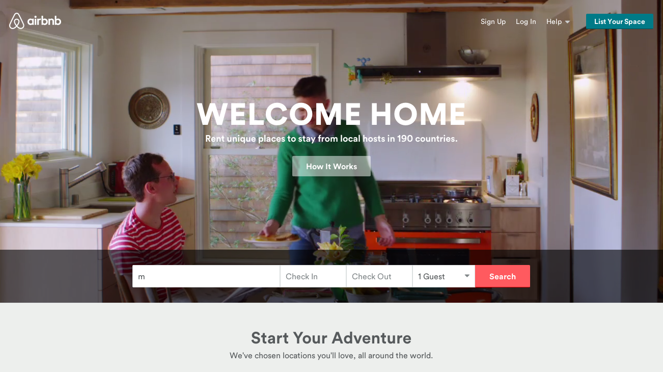
Sidenote: Using video in the homepage slider area is becoming a hot trend, as PayPal, Spotify and Hubspot are all using it.
In addition to the awe-inspiring imagery, the Airbnb site is designed with a clean aesthetic. Modern, flat buttons are used throughout, and all site elements are balanced with plenty of white space. This modern look is likely to appeal to the young, internet savvy demographic who are most likely to use the service. While I'm only lukewarm about the idea of staying at someone's place versus a hotel, the trendy, Instagram-style photos make me feel like I would be unhip not to give Airbnb a try.
Its Simple Design Makes Business Sense
This site was designed with business goals in mind. While the image-heavy design is visually pleasing, it wasn’t designed to simply look pretty. There are two main objectives of the site: 1) to get visitors to look for rentals, and 2) to get new listings. Because there is so little text on the top part of the home page, we are compelled to look at either the large video background, the “list your space” button in the top right corner or the search area for rentals. The user is not overwhelmed with a bunch of text they’re not going to read . This site gets visitors right where they want to go.
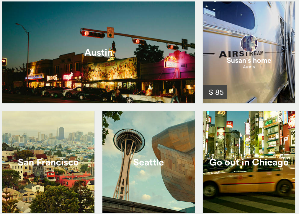
If you scroll down the homepage, Airbnb demonstrates the unconventional possibilities you have by ditching the standard hotel route. Who hasn’t dreamed of going on vacation and staying in an Airstream? Oh wait, I haven't ... but it's still cool.
When you actually start searching for a place, the Airbnb user-experience can’t be beat. After you pick your city, the search page displays a large city map on the left half of the screen with large rental photos on the right. All of the most pertinent information – price, location area, and the person renting the property – is displayed in large type so that it is easy to digest at a glance.
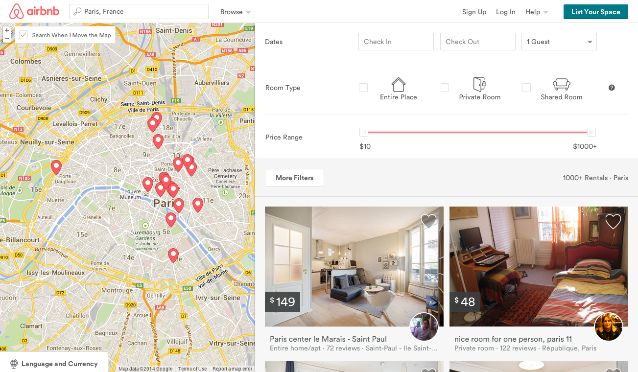
Let’s compare this user-experience to that of Priceline. Much of the same information is available, but you have to search for the location map. The images are smaller and less impactful. The Priceline page is definitely navigable but it is more work, as users have to scroll up and down to access all filters. Airbnb, on the other hand, has a simple and highly visible “more filters” button that shows and hides filterable information.
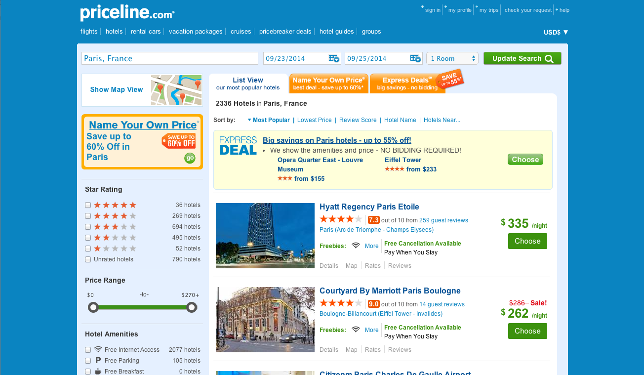
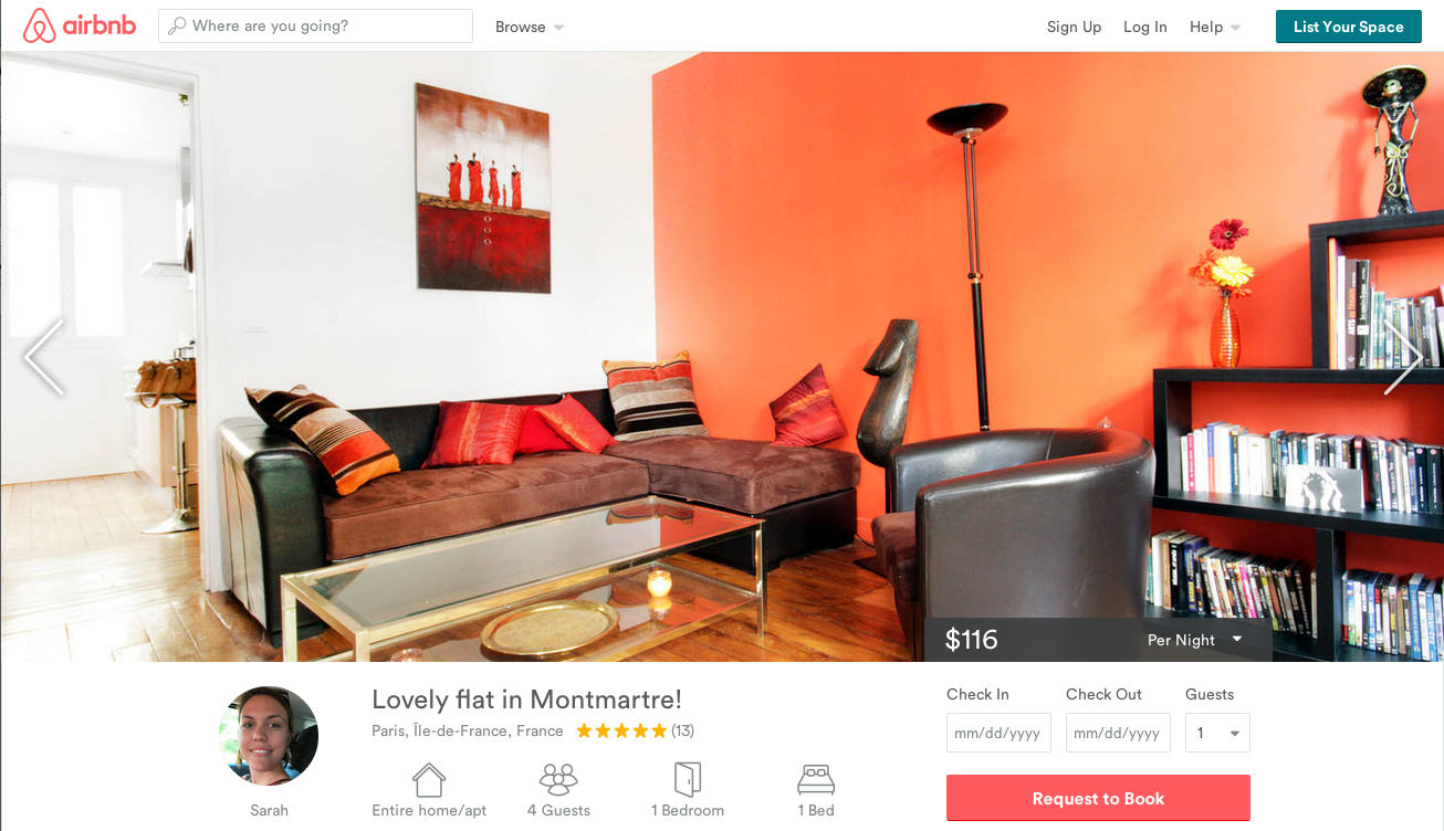
And when you want to actually view a place, there is a world of difference between Airbnb and Priceline – take a look:
Airbnb
Priceline
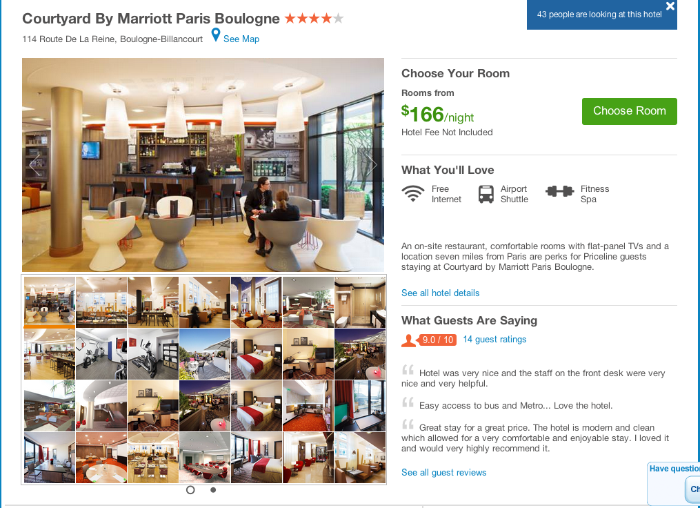
The large full-size images of the Airbnb site make me feel like I know exactly what I'm getting into ... although I very well may not. I haven’t actually stayed at an Airbnb home yet, and I’m still a little wary of this new way of travel, but their website is smart and beautiful. Priceline and other hotel sites should definitely take some design cues from Airbnb.