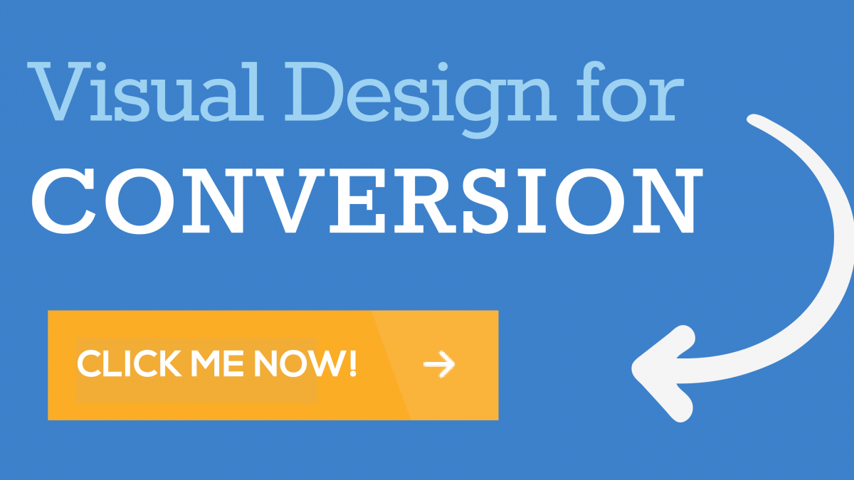
Visual Design for Conversion
When clients come to LevelTen for a site redesign, they are often focused on adding feature upon feature to their new site. Yes, features are important and needed but the real goal of your company site should be to convert visitors into users or customers. As a designer, my job is not to just make things look pretty, but to actually use visual design to help clients meet business goals.
Visitors are easily distracted and make snap judgments about the credibility and worthiness of a company based on a glance at a site. If visitors are not instantly engaged, they will leave the site and are not likely to return. It may seem like tall order to design a site that engages visitors from varying demographic groups in a split second, but if you follow these design principles you’ll be off to a great start.
Whitespace
For those unfamiliar with the concept of whitespace, whitespace does not actually have to be white – it just needs to be blank. So basically, all of the design elements on your site should have plenty of blank space around them to breathe. In other words, don’t clutter up your site. If your site is cluttered with information, not only will it be confusing, your most important messaging and call-to-actions will not stand out from the rest of the page. The most important part of your site should be your call-to-actions that actually get you conversions to meet your business goals. If your site isn’t making you money or getting you customers, what’s the point in paying for a fancy redesign?
Use Color and Contrast
Whatever the color scheme is for your site, use colors for your call-to-actions that stand out from the rest of the site (while still keeping the site design attractive). If your site consists of blue and neutral tones, select a brightly colored call-to-action to draw the eye.
Also, consider using the psychology of color in your color choices. Research has shown that orange is the one of the best colors for call-to-action buttons.
Black: authority, power, death
White: innocence, purity
Red: love, passion, intensity, anger, danger, hot, excitement
Pink: romance, youth, energy, feminine
Blue: peace, tranquil, stable, trustworthy
Green: nature, growth, organic, positive
Yellow: emotional, positive, cheerful
Purple: luxury, wealth, and sophistication
Brown: solid, reliable, earthy, organic
Select Imagery with Care
No matter what your business does, the imagery on your site should make a human connection. Attractive, happy faces work best for engaging users. Studies have shown that humans have a natural preference for looking at faces, so even if you’re selling widgets (or other nonhuman type products), find a way to make a human connection through imagery. If you can engage users through photos, your conversion rate will benefit.
Use Arrows
Users are in a hurry and aren’t in the mood to hunt for things. Help your visitors by adding a few well-placed arrows (if it suits the design). Arrows guide users by providing focus and direction – a great addition to a call-to-action.
Keep It Simple
Along, with plenty of white space, keep your overall website design clean. Keeping a design “clean” means using a pleasing color palette, consistent use of typography, minimal effects and getting rid of unneeded information. The last thing you want to do is overwhelm users with information and clutter. If users are overwhelmed, they will miss call-to-actions. Keep the design simple, clean and attractive to improve conversion.
Curious if your website is designed for conversion? Contact us today for a website audit!

