Don't Make These 5 Common Call To Action Mistakes
A call to action is text or an image that ultimately leads users to a next step within your site. Ideally, your call to action (CTA) will allow the user to redeem some kind of offer in return for their contact information. A successful CTA will generate more leads and sales for your business. So why are you not seeing the results you want? Maybe you are making these five common mistakes:
1. Your Users Don't Care About Your Offer
[caption] Image Source: Sutha Kamal[/caption]
Be minduful when putting together your CTA offer. What kinds of things would your visitors be particularly interested in? Would they enjoy an e-book full of inspirational quotes, or would they more likely want to hear an informative podcast? Just like when creating any kind of content, be sure to know your audience and what they are seeking.
2. You've Placed Your CTA Below the Fold
All of your important information should be above the fold (within the portion of the page that first appears without having to scroll). The first visible pieces of content on your site will help the user determine if he or she will scroll down to view more. Take the time to place your CTA above the fold - it could catch that new visitor's eye.
3. Vague or Unrelated Text
Be straight forward with your text. You have something to offer the user. Don't make them guess what to do. Stay away from vague or unrelated words like, "Contact Us" or "Click Here". If people don't know what they are clicking, they won't want to click it. "Contact Us" doesn't get your offer across and could be seen as a link to your contact page.
Instead of misleading text, use definitive, urgent words to lead your users such as "Register Today For Our Free Webinar" or "Download a Free Copy of the E-Book". These kinds of statements are pressing and give the user incentive to click since they know where they are being lead. Google's Chrome page is a good example of a clean CTA.
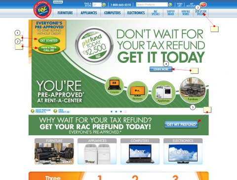
4. You've Given the User Too Many Options
Don't overdo your calls to action. Having too many offers or buttons can overwhelm the visitor and ultimately get them away from the track, or funnel, you want them to go down. Remember know your audience and stick to using one effective offer.
[caption] Too many calls to action can confuse users[/caption]
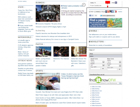
5. Your CTA is Camouflaged
Don't be afraid to bold your text or add vivid colors and graphics to make your CTA stand out. It's too easy for plain text in a sidebar to be overlooked, so make sure you do something to grab the user's attention.
[caption] Don't let your CTA blend in with other text on your site[/caption]
Do you agree with this list? What are some other best practices you've found for CTAs?
Featured Image Credit: John Spencer


