Four Tips for Great Calls-To-Action
Any time you have gone on to a website, you might have seen a call-to-action. This element on the website, one that is an important piece for anyone practicing inbound marketing, is used to gain the attention of a visitor. The CTA should not only grab a users attention, but also entice them to click on said CTA to generate an action. Following these tips will help you get started with building great calls-to-actions.
Be clear about the offer you want your visitor to see
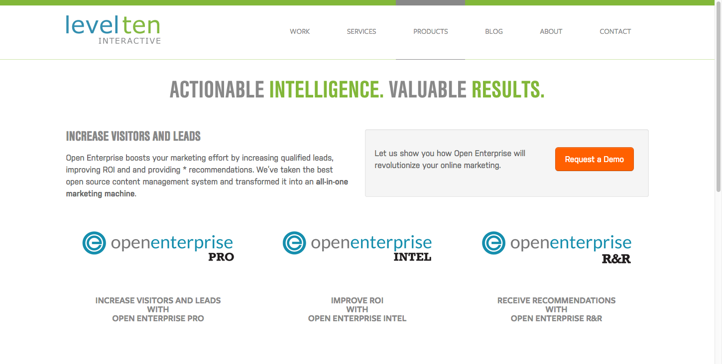
What is the purpose of your CTA? What do you want them to do? CTA's can tell your visitors subscribe to your email newsletter list, download an eBook, maybe a white paper, or even to ask for a demo of a product you might have. Below is an example of a CTA on our website:
Keep Your Calls-To-Action above the Fold
If you practice inbound marketing, you would know to keep what you want visitors to click on or engage with, above the fold. If you have no idea of what the "fold" is, then let me explain. The "fold" on a website is the first thing you see when the web page loads and it fits on your browser. Take the image above for example. That is a screenshot of our product's page; the first thing you see is centered header followed by a CTA. All of this is visible before a visitor even has the chance to scroll. Think about it as a newspaper and the "fold" when you pick one up. What do you see first? The headline and featured image and story of course. The CTA would be considered the "feature image" and can easily be seen by the bright button.
Make Your Visitor See the CTA (Color)
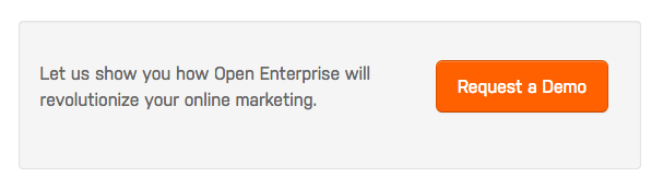
Again, take the image above, the orange button pops on the page full of neutral colors. Make your call-to-action have a button that will draw the visitors eyes gravitate to the action button. Also, notice the contrasting colors. The region is a few shades darker than the all white page background.
A closer look to the CTA is featured below:
Make your CTA be relevant to the rest of the content on the landing page
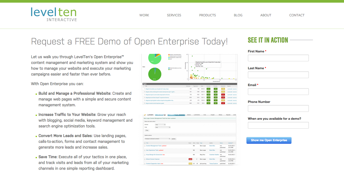
If you are asking the visitor if he or she wants to download a white paper, eBook, or asking to request a demo, like the one above, then make sure it is clearly relevant to what the button says it's informing the visitor to do. The CTA button in the image above, leads to the landing page seen below, and as you can see, both have similar words. Both mention "Open Enterprise" and "demo". You don't want to miss lead your visitors.
What are some other tips you follow that should be included? Let me know in the comments!