Four Rules for Creating Effective Calls-to-Action
Websites rarely exist to be solely informational. Websites are tools for meeting business goals and objectives. Almost all websites have an action, or multiple actions they ask users to complete. Let’s examine how to prompt users to take the action you want through effective call-to-action design.
1. Limit the Number of Proposed Actions
Call-to-Action design may be the perfect instance to apply psychologist Barry Schwartz’s theory “The Paradox of Choice.” Schwartz theorizes that offering too many options often leads consumers to overthink and overcomplicate decisions, thus leading to frustration.
With this in mind, it’s important to remember that users will become overwhelmed by webpages littered with buttons or other calls-to-action. You definitely do not want your webpage looking like the teaser image for this blog post. Focus on the most important user actions and make them prominent so that key goals are met. People don’t want to have to think. Use buttons to guide your users through the actions you want them to take.
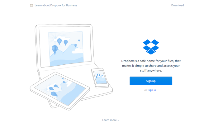
Note how Dropbox.com has three call-to-actions visible at the top of their homepage. Signing up is clearly the most important objective, as the "sign up" button is the focal point of the page. Users don't have to think very hard about what they're supposed to do here.

2. Make it Pop
If you’ve ever watched a makeover show, you know that good makeup artists make the eyes “pop.” Makeup artists will typically use dramatic makeup in dark or bright colors to make eyes stand out and become the focal point of the face. A designer must treat a call-to-action in the same manner. An effective call-to-action will typically be brightly colored or wrapped in a large button so that it stands out and becomes the user’s focal point.
It’s difficult to outline hard and fast rules for button or call-to-action color selection because research has shown that no one color is most effective. Color and size effectiveness depend on the context of the page. What we do know is that good CTAs always stand out, and they should probably be tested against other design options.
One quick way that designers recommend testing the “pop” of a call-to-action is doing the squint test. Squint at your page and make sure that even while blurry you can pick out your call-to-action. If you can spot the CTA even through squinted eyes, a user will most likely spot it too.
If you squint your eyes and look at uber.com, you definitely won't miss the two main call-to-actions on the page. Uber's use of black and white photography combined with brightly colored buttons, make their CTAs hard to miss. Of course, most websites aren't black and white, but this is a great example of the importance of contrast.

3. Urge Users to Act with Compelling Language
The point of a call-to-action is to get a user to perform a certain action, so it’s important to use action words. Use verbs to create a sense of urgency that will motivate users to act. Here are some good examples:
- Try
- Start
- Get
- See
- Call
- Donate
These words encourage users to take an action by being short and direct. To create a sense of urgency, add time oriented words like “now” or “today.” Make users feel compelled to take action now instead of later.
Here are examples of sites that use succinct but persuasive copy on their CTAs:


4. Test it!
Even when you think you’ve designed the perfect call-to-action, research may prove you wrong. You may think that a bright orange button will catch everyone’s eye, but it might turn out that it blends in with the site more than you realize. Test a few different designs and see which gets the most conversions. You’ll find that even minor adjustments to copy or design can have a significant impact on conversions.
Have examples of great, effective calls-to-action? Share them and let's discuss!

