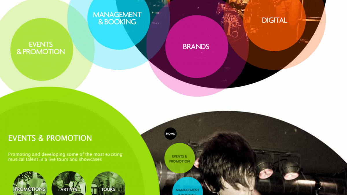
Top 5 Web Design Trends for 2013 I Hate
Yes, I'm a bit like JoJo the idiot circus boy with a pretty new pet when it comes to most web design trends. The ones I'm about to address, however, have already made my Top 5 Web Design Trends for 2013 I Hate (or am really tired of). I based my list after reading Jake Rocheleau's post on the 20 Hottest Trends To Watch Out For In 2013.
Gretchen, our designer, wrote her list of 5 Web Design Trends she loves last week.
I'm certain this will be a little controversial, and my colleagues might say I've lost it, but here we go.
5. Circular Design Elements - Really? Circles? What about squares or triangles or octagons for all you MMA'ers out there? Look, I get it that cleaner, better design is coming and circles do break the horizonal/vertical monotony, but as a trend? Please. It seems to me, a few short years ago, we had circles in more explosive form: star bursts. And wow don't those feel a bit dated?
4. Single Page Web Design - In theory, this is a really cool idea. Honestly, I really only have one good reason to not do this and that's inbound marketing. If you're not familiar, you should be. It's where things are heading. Inbound marketing is built around producing lots of good viable content and doing it on a regular basis. Ultimately, if you're Coke, this single page concept might work for you. However, if you're a small to mid-sized business looking to see some growth online this year, the one page website is your worst design nightmare.
3. Social Media Badges - I get it, you're social. But I'm not on 100 different social networks, so why put them out there? In my opinion, a website should have no more than 8 badges tops. Let me give them to you... because I honestly don't care about the other 92. Facebook, Twitter, YouTube, LinkedIn, Pinterest, Google+, Flickr (ed. note: what about Tumblr?) & Instagram; after that I'm pretty much tapped out on my social connection. Unless you have a specialized reason for being there (i.e. most of your audience is there), don't over badge to look cool.
2. Digital QR Codes (on websites) - Honestly, how stupid am I that I need you to put a QR code on your website? Aren't I already on your website? Now I have to open a QR code reader app, that will then most likely take me to some mobile version of your website (mobile is a good thing!). But do you feel I'm not intelligent enough to just visit your mobile site on my phone directly? If I were on a mobile device already, how am I going to scan that anyway? Grab another phone? What's the real world application? Think this through first, please.
1. Parallax Scrolling - I get it. You're a really cool and edgy company and you want everyone to know. Your scroll is cool too but I'm more concerned with what's happening as I scroll than what you have to say. I do think this is an amazing affect, but in the end it has a very strong gold plating feel. Plus, see number 4 on this list.
What design trends or styles are you sick of? Let us know your thoughts in the comments below.


