
Why I love to hate building blogs.
Blogs. Blogs. Blogs. You say it enough, and the word suddenly loses all meaning. Blogs.
It seems that everyone needs or wants a blog, but no one actually knows how it should actually look. This is a topic that everyone in our office has talked about in a number of meetings, over lunch, sometimes extending into our Think 'n Drink sessions. What is the best way to architect a blog? Is there some sort of status quo or set of best practices we should be following? We aren't even sure if there are any, so let's just make some up and see what happens.
For clarification, this is only referring to the data architecture of a blog roll, not the actual design - because we'd be here forever if it was.
Featured Blog Post
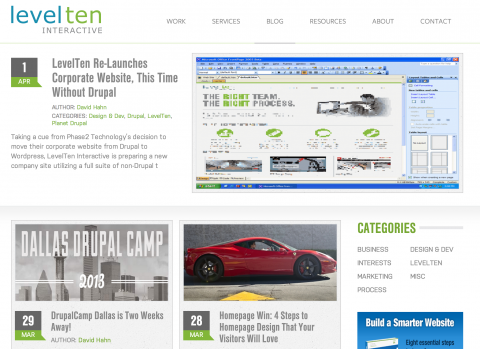
Sometimes whenever your company or organization puts out a new blog post, you want to put it in the spot light. Throw on the glitter, jazz it up, whatever. (Generally, it comes down to making it look bigger than the others). But if the new post is always going to show up at the top, why do we have to make it look fancier? I think one alternative to would be to maybe have an actual "featured" blog post. Sometimes there are blog posts that are just fillers, or highlighting a random news incident, but some posts are actually important and need some attention, so consider leaving that stickied to the top for a couple of days. Our own blog is actually a great example of a featured blog post.
Grids or rows
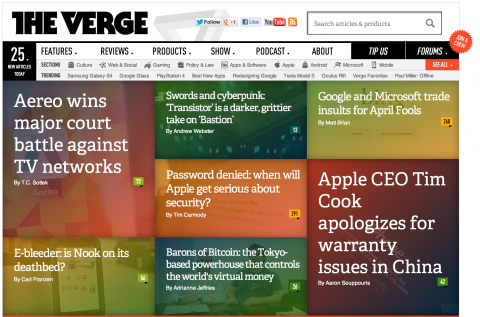
Pencils or pens, forks or spoons, who knows? Most of us would expect to see the blog roll in a row format typically because that's the default, but don't let that stifle your creativity. Putting your blog roll into a grid can give your blog a little more of an edgy or cleaner look, but don't get too crazy. If you look at our own blog roll, we decided to go with a responsive grid and let Masonry handle the vertical differences, kind of like Pinterest-esque blogging. I think one of my favorite looking grid based blogs is the homepage of The Verge.
Listing Images and Titles
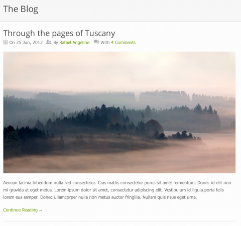
Where the image is located is always an issue when architecting a blog roll layout, and there are two common options you can go with. One option is to separate the blog post into two columns, usually a 25/75 layout, and put a thumbnail of the image on the left (generally). The other is to list the image above the body or summary of the content. If the image is above the body, do you put the title above or below the image? Honestly, I would put it above. I know that a picture is worth a thousand words, but this is the internet, and that image could be meaningless. Write a well crafted title, get better SEO, and put the title above the image. The Sensation theme for Wordpress makes a great example of this.
The sidebar.
I think widgets that go in the sidebar is a relatively delicate topic. It can be as easy as putting in two simple widgets, whereas others will throw in the kitchen sink. I like to think of the sidebar on a blog as a tool to help me find other blog posts on this particular site. I'd say put up 2 or 3 of the most commonly used widgets, which are probably categories, popular posts, and a wildcard widget. The wildcard will either be a Twitter feed, tags or tag cloud, call-to-action, or advertisement.
Things that piss me off

In order from blog specific to non-blog specific.
Too much information. Whenever I see a blog roll and read through the posts, the entire post is being displayed in the blog roll… Why? If I wanted to read the whole blog post, I would read the title and maybe a summary of the blog post to determine if I actually had any interest in reading it.
Too little information. This is what summaries are for. Unless you crafted a very well written title, I probably have no idea what you're talking about and I'm just going to skip it.
Giant header images. Though sometimes they give a nice looking artsy effect, they often get in the way. This isn't supposed to be a portfolio to show off, it's a blog. People come here to read your thoughts, opinions, news articles, etc.
Modal windows. Two things I hate: when they pop up asking me to subscribe and when you actually have to click the X to close the modal window. Half the time I can't find it anyway, so I click on the outside of the box to close it. Please, if you're going to be annoying, have a little mercy.
Cufón fonts. I don't know when this became popular, but it needs to go away.
Background music. Stahp it.
What are your thoughts on the architecture of blogs? Are there things we definitely do need or others that can always be left out?

