Marketing Your Brand Through User Experience
"The customer is always right"
Here lies the iconic phrase that sits at the heart of practically every business's values. And yet, it sometimes seems to get lost in the mix of web-technical jargon when it comes to web design and development.
Having a solid user experience makes it easier for your business to promote its products or services. Your website’s engineering and content should always revolve around a user-centered approach. If you’ve lost sight of your user, you’ve lost sight of your website’s goal. There are seemingly endless aspects to keep in mind when creating your UX. However, your font choice, color scheme, responsive design, and navigation map are great places to start.
Choose Your Fonts Wisely
Fonts can make or break your user experience. It sounds dramatic, but fonts are inherent in the creative process for aesthetic appeal. They strengthen your theme, influence your users’ moods, focus your message, and depict your website’s vision
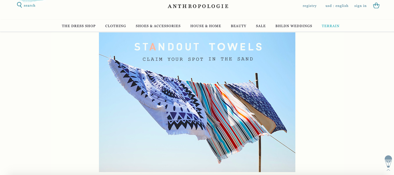
Image Source: Anthropologie
Your fonts should be consistent with the experience you’re trying to give. If you’re a women’s accessory, clothing, and home goods store, like Anthropologie, your site fonts should be exploding with tasteful, cutesy appeals. Notice how their font and text are consistent with the message. They even changed the color of the “A” for the “Standout Towels.” It’s awesome how small changes can really make your text work for you.
It’s good to aim to have no more than three fonts on your website like Anthropologie has done. Three is great for some differentiation to break up the page and tease the eye. However, too many more can distract from the message.
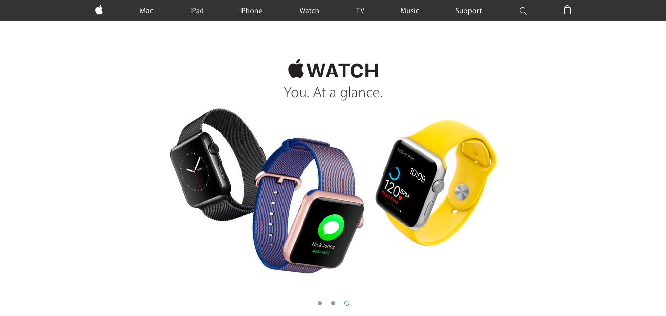
Image Source: Apple
Likewise, if you’re a tech company, like Apple, your fonts should reflect your brand with a clean, sleek, look-and-feel without being boring or mundane.

It’s safe to stray away from using typewriter-like fonts, such as Courier, for text heavy areas unless for some reason you have hit the perfect balance between vintage and fun (see Anthropologie) or unless your audience is full of self-proclaimed, old-spirited hipsters.
For example,
Welcome to Fairy Shire: where dragons, unicorns, and leprechauns coexist.
I think I actually yawned while typing that. You don’t want your visitors falling asleep while they’re reading potentially useful information that can get them what they need and give your business what it needs ($).
Differentiate Yourself with Your Color Palette
Your color palette is crucial for branding with your website. Similar to a website's font, colors peak viewer interest, generate emotions, and set the stage for a positive user experience. One of the ways people learn to recognize brands is through color association.
For example, think of Coca-Cola, what three colors come to the top of your head?
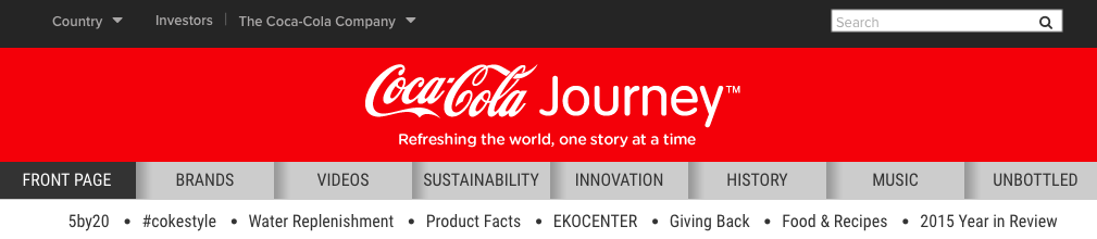
Image Source: Coca-Cola
If you guessed red, white, and black then you would be correct. Building a brand requires so many inputs, so be careful when selecting your color scheme. It just might stick.
Your colors are also particularly important when it comes to your call-to-action buttons. Your CTA button color can help depict the type of message you’re trying to convey as users associate certain colors with specific feelings.

Image Source: MOZ
There are many studies on how consumers psychologically tie colors with personalities. Yellow is often associated with optimism and happiness, while blue is linked to dependence and trustworthiness. This color scheme is definitely ideal for Moz, a marketing analytics and inbound marketing service company.
In addition, one of the easiest A/B testing techniques can be done by simply changing your CTA button color. When your CTA button shows contrast with its respective background, you should see higher conversion rates.
Be Responsive
A responsive website provides users with an optimal viewing experience. A responsive layout is one in which the layout of the webpage adapts to the capabilities and screen size of the viewing device. It’s also Google’s most recommended design pattern for mobile configuration. It’s better to have a single, more efficient, URL than to have multiple separate versions that require frequent indexing and updates.
Since people today have access to the web on so many different devices, consistency is crucial. You want your website to work well whether your user accesses it on a desktop, tablet, or smart phone.
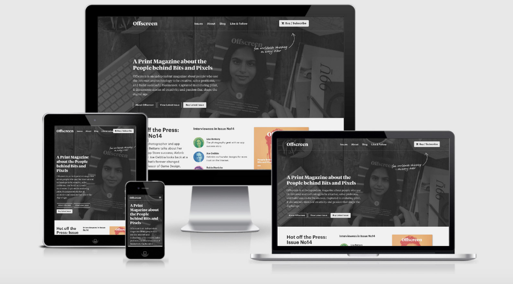
Responsive Design.is offers stellar examples of responsive web design such as the different display screens for Offscreen Magazine.
Today, a truly responsive site involves more than just your desktop. When considering UX, you have to factor in mobile-responsiveness as well. This is not only useful to your users, but it is also important for SEO reasons as Google penalizes web sites that lack mobile responsiveness.
Google further validated the importance of mobile-friendly web sites on May 12, 2016 when its Webmaster Trends Analyst John Mueller announced on his twitter page that “the mobile changes mentioned here are now fully rolled out.” Thus, making mobile-responsiveness an even greater priority for search engine ranking.
Make Your Navigation Bar Navigable
Your user should never have to ask “how did I get here?” when going through your website. No one likes getting lost. If your user is lost, your potential for conversion could be too. Think of your navigation bar as the visitors’ personal tour guide, showing the user the right places to go and bookmarking the interesting landmark stops along the way.
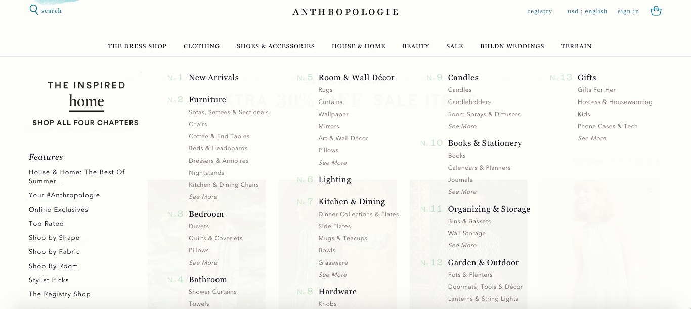
Image Source: Anthropologie
When you mouse over the House & Home section of Anthropologie’s navigation bar, you are given a comprehensive spread of everything you could ever be looking for and more to spruce up your home.
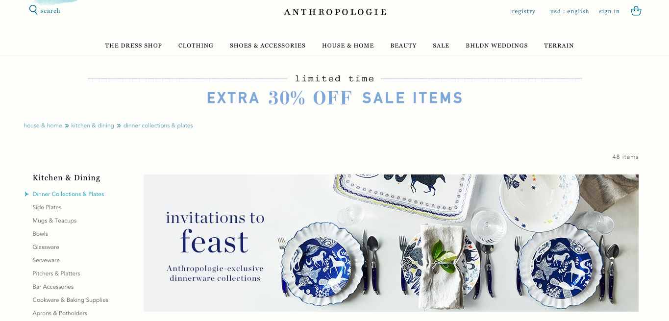
Image Source: Anthropologie
After selecting the “Kitchen & Dining” section, you are given the route that you took at the top of your listings. As if that isn’t enough, they offer a side navigation bar that gives you your section as well as everything else you would be interested in within the section itself. The road trip is complete, with our destination as user satisfaction.
From the most simplistic of marketing perspectives, discover your customers' needs and then meet them. It's easy to lose focus in the technical side of development. Keep your visuals aesthetic, your formats consistent, and your pathways simple. You'll pave your way towards a successful website as long as you keep your customer at the forefront of your UX decisions.