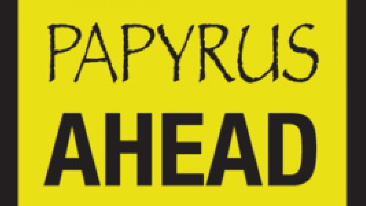
Papyrus, I Hate You
I’ve always been told that “hate” is a very strong word, but sometimes it's just necessary. And yes, I hate the Papyrus typeface.
If you have any interest in design, typography or even just own a computer, you are probably familiar with oh-so-overused Papyrus. As I sit here and blog about uncool fonts, I can’t help but feel like a cliché design diva, but lately Papyrus has taunted me everywhere I go and I am irritated.
Why the emotion you ask? Well … the fact that anyone turns to Papyrus as their typeface of choice reminds me of how little attention certain people pay to their design and branding. Papyrus is commonly found on the awnings of new age shops, “hip” coffee shops, yoga studios, etc. The users of Papyrus seem to think that it is unique and clever … to that I say, on the contrary. Papyrus is so overused that all it communicates is, “I have no original ideas in my head and I designed this in Microsoft Word.”
I was crushed when, back in my hometown of Austin, I spotted some brand new signage near 8th and Brazos … I was walking along, breathing in the artsy, funk that Austin has to offer when I stopped in my tracks as the Papyrus signage caught my eye. I was distraught and snapped the photo below, almost as if I would be able to turn it into the design police. Austin, you are too unique to use a gimmicky, “unique” typeface like this.

Not only is Papyrus unoriginal, it simply isn't attractive. While shopping recently, I came across a doormat that would have been perfectly lovely had it not had a Papyrus welcome message plastered across the middle.

If you’re a business looking for a creative and quirky typeface to communicate the personality of your organization, look to the company logos below for inspiration on how to communicate the message that your business is whimsical, bohemian, natural, quirky, unique or trendy WITHOUT the use of Papyrus.


For more hating on Papyrus, check out: http://papyrus-sucks.com/

