Homepage Fail: 3 Traps of Homepage Design that is Killing Most Websites
The single most important page on your website is your homepage. It is the one place that most of your customers will be exposed to your brand for the first time. It is critical to make a great first impression.
Your homepage is where most people will first enter your site. It is also the page they will come back to the most, like the often-used home button on an iPhone or iPad. Unfortunately, many homepages are over-engineered and cluttered with too much information, which is the exact opposite from what most visitors want.
The primary thing your site visitors want from your homepage is simplicity. They are coming to your website to find the information they want. Not to wade through a maze of brand messages and self-serving navigation.
Trap #1 – Forcing your message
Too many homepages try to force feed a multitude of messages that the site owner wants the visitor to read. This tendency stems from traditional corporate communications philosophies that assume the organization is in charge and must control the engagement.
You are not in charge. With all of your competitors just a search engine click away, the visitor is in charge.
The primary thing your homepage needs to do is build trust. Overwhelming visitors with your agenda does not build trust. Connecting with the visitor and helping them get to what they want does.
Trap #2 – Information overload

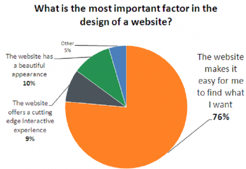
Source: HubSpot, The Science of Website Redesign, June 2011
Many site owners try to wow their visitors with flashy multimedia elements and advanced features. The more-is-better mentality takes over, leading to dozens of messages and actions all competing for mind share.
Often these features are well intentioned and come out of an honest attempt to build a better user experience for the visitor. Most often they just end up being overwhelmed. What users really want from a website is simplicity, not more features - at least not during their first homepage experience.
There is a time and place for animation and multimedia. Features that drive interaction and engagement are great – when the visitor is ready for them. When they are first coming to your website, help them get their bearings.
Make your homepage simple to comprehend. Think of making it like a quick start guide you might get with a computer or complicated piece of electronics.
Your homepage should be a simple guide to this complex machine that is your website.
Trap #3 – Not optimizing for search
Before you can impress your visitors, you have to get them to your site. The most effective method for generating new, qualified visitors to your site is the search engines. The page with the most potential to rank well and drive high quality traffic is your homepage. Yet, most homepages are not optimized to make the most out of this powerful opportunity.
A few paragraphs of keyword-optimized content on your homepage will go a long way. Many homepages shun any text in favor of a highly graphical layout. Some homepages, following the more-is-better approach, have too much text covering too many topics to rank well for targeted keywords. Rarely are the page title and the body copy properly optimized around the high value keywords.
By assuring your homepage is following the search engine best practices the rest of the pages of your site are using, you can transform your homepage into an invaluable traffic generator.
Learn More

Guilty of one or more of these traps? Don’t worry you’re not alone. In my next post I will cover the four steps to a great homepage design that will keep you from the traps.
This post is an excerpt from the Website Redesign Success ebook. The ebook walks you through 8 simple steps to building a results-oriented website.

