If You Didn't Design for Mobile, Redesign for Mobile
So, you're familiar with all the statistics on mobile usage. You're convinced that sites should design for mobile development first. But your site launched before the mobile development craze, so now what do you do?
You don't have to completely rebrand your company or give your website a whole new look, but you should probably make some tweaks to the design of your site so that it's more mobile friendly.
Facebook is a great site to look to as an example of adapting to mobile. Throughout the years the site was cluttered with wordy links and a large logo that at one point included an image of a man's face.
But over time you can see how the company has advanced in terms of placement of copy and images. Take a look at the following pictures of Facebook throughout the years
2004

2006

2007

2009

2010

2012

Glancing through these snapshots, you can see how not only the site's look changed, but the content changed too. Personal information has been replaced with a stream of user actions and images at the forefront of his or her page. Things that are not visually heavy tend to get placed in other sections.
Then, earlier this summer, Facebook unveiled its leanest look ever.
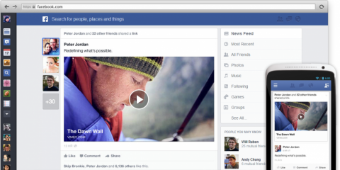
The site now looks like it's a mobile site. Clickable icons in the top navigation are better suited for touch screens and eliminate the wordy links, saving precious design space. A tidy news feed is lined up with the top navigation, and the blue background sets off the white border of the updates causing them to pop.
This picture nicely demonstrates the seamless transition available to the user going from desktop to mobile. The best part is that when using Facebook on your computer, the site feels natural, not like it's been forced into a condensed version of its former self.
My hope is that by looking at this timeline of updates, you feel encouraged that it's possible to adapt your site to mobile while still keeping your information and brand identity intact. Little changes can make a big difference in user experience.
What kinds of changes have you made to make your site more mobile friendly? Let us know in the comments below!
Featured Image Credit: juhansonin
Image Sources: Shareaholic, Huffington Post