Five Web Design Trends I Love
With the dawn of 2013, I am left wondering which web design trends from 2011 and 2012 (other than responsive web design) will gain momentum in the new year. It’s hard to say … Much of what is popular in web design right now has been trending for several years, so I won’t attempt to predict what will be hot this year. Instead, I will share a short list of emerging trends that I love.
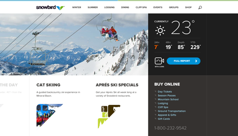
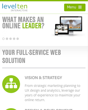
1. Sticky Menus/ Fixed Navigation
A sticky menu is a header bar that is in a fixed position. As users scroll down a page, the navigation bar remains visible at the top of the page for users to access.
This is a great usability feature because it prevents users from having to scroll back to the top of the page to navigate a site. Usability studies have shown that not only are sticky menus faster to navigate, users have an overwhelming preference for them.
Additionally, most websites have their branding located at the top of their website next to their navigation, so with both the branding and the navigation in a fixed position, the users get even more exposure to the company branding.
Here are some great sites with fixed navigation:
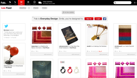
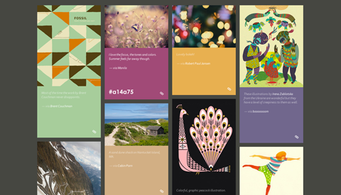
2. Masonry Layout/Dynamic Grid Layout
A masonry layout is one in which photos and their accompanying blurbs of information are tiled on a page. Typically, these tiles have varying heights and are designed in a simple fashion so that the images on the site are the main focal point for the user. The result is a clean, full screen of images that keep the user engaged and continuously browsing.
Don’t know what am I talking about? Take a look Pinterest. This alternating full-page tile design is all the rage on the web right now. When we designed the new Level Ten site just a couple of months ago, we chose masonry layout for our blog because of how easy it is to browse and how the array of images displayed keep the users engaged.
Read more details about masonry layouts in my collegue’s recent blog: Using jQuery Masonry for a creative Pinterest effect in Drupal
Here are some of my favorite sites that use masonry layouts:
3. Mobile Navigation Toggle
While looking at mobile versions of sites recently, I've noticed that many sites are now turning their navigation into dropdown menus when users tap a toggle or menu icon. Using a toggle to allow users to show and hide site navigation is a great way to keep content the focus of a site’s page while also making navigation readily accessible. This very website is a great example of using a toggle for navigation. Check out our site on your mobile device or resize your browser.
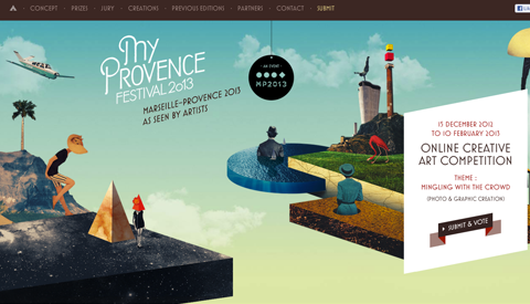
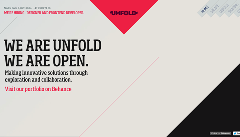
4. Single Page Web Designs
For the right candidate, single page designs are great for distilling all of an organization’s most important content into a single page that is quickly and easily perused. Single web page designs tend to be visually dazzling and full of jquery effects that are sure to please users.
Of course single page designs are not for everyone. If an organization has a great deal of content, single page designs are not the right choice. If, however, an organization or individual has a limited amount of content to showcase, the site might be more effective if everything is condensed into a single, beautiful and interesting page.
Here are some examples of single page design done well:
5. Larger Body Font Size
Designers, including me, used to think that 10-12 pixel fonts were big enough for body copy on the web. However, with the rise of responsive design, it is becoming standard that 14-16 pixel sized fonts be used for main body copy. This increased font size is best for readability across platforms. In addition, increased line height is recommended. So while small text looks nice and tidy, legibility across devices is far more important.
Do you have any thoughts on design features for 2013? Please leave a comment below!