Five Hot Web Design Trends for 2015
The web is getting more beautiful and user-friendly everyday. Many design trends that we see today began years ago, and we are watching them continue to evolve. Let’s examine how current trends will evolve in 2015, and what new trends will emerge.
1. Big Image/Video Backgrounds
Some could argue that large image and video backgrounds are getting pretty overdone, but that doesn’t change the fact that they are on trend. Users are dazzled by imagery, and large, beautiful images can completely set the tone for a site. I predict we will start to see these big images altered in new and creative ways to set sites apart from one another. The image blur is already popular, but other filters and color overlay techniques may become common this year.
If you are eager to follow the big image/video background trend, but don’t have a large budget, here are some great resources for free photos and looping video:
Free Stock Photos
Free Looping Stock Video
Is the big image trend overdone? Yes definitely – but it’s not going anywhere in 2015. Bye-bye image carousels – you are soooo 2013.
Here are some examples of sites using large background images/video in new and unique ways (go to the sites for full-effect):
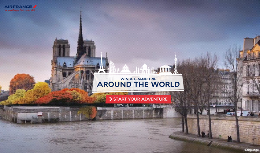
AirFrance - Traveling the World
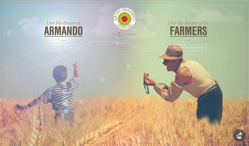
Grano Armando
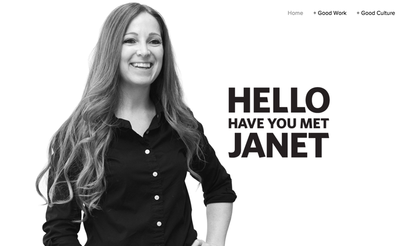
Have you met Janet?
manuelamisani.com/triptych/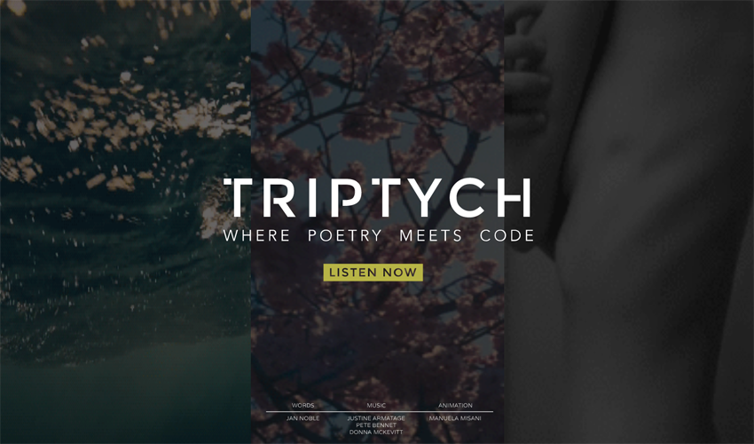
2. Custom Photography & video
Now that I’ve provided you with some really amazing free stock photo/video resources (above), let me say that I think 2015 will be the year of custom photography and video. Of course stock images have their place, but if your budget allows for it, custom photography is a much better option.
With large image/video backgrounds becoming so popular, it’s important to stand out from the crowd. Anyone can throw up a nice large image and look trendy and cool, but does a stock image really tell the story of your product or company? Custom photography can go much further.
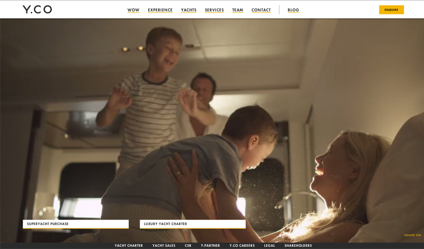
Take y.co for example – the user is immediately drawn into what the site is about with the custom background video. If this site had just used a picture or video of a generic-looking couple on a boat, it would be much less effective.
Y.CO
3. Animation & infographics
The use of clever, well-planned custom animations and infographics will play a big role in design this year. An intelligent animation or infographic that tells a story about a company or product can communicate more than an old-fashioned slider or carousel.
Here are some interesting sites that use animation and infographics to tell their story:
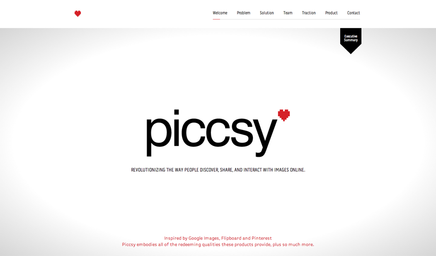
Piccsy
Mini Cooper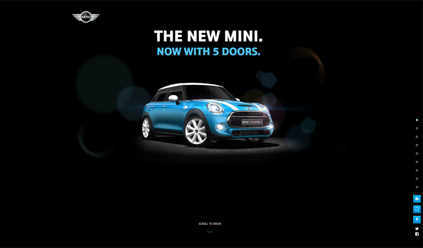
4. Mostly Flat Design
Flat design is still hot, but like the big image trend, it’s evolving. Many designers are starting to incorporate subtle gradients and drop shadows back into mostly flat designs. Some research on call-to-action conversion shows that buttons that have a bit more depth (using gradients and drop shadows) have higher conversion rates. Flat design is here to stay in 2015, but it will start to use subtle shadows and other effects to make elements appear more actionable.
5. Microinteractions
Microinteractions are small bits of functionality on a site. For example, giving something a star rating, filling out an e-mail signup box or “liking” something are all microinteractions. Microinteractions engage users, and user engagement is good. Microinteractions are great way to highlight calls-to-action on your site.
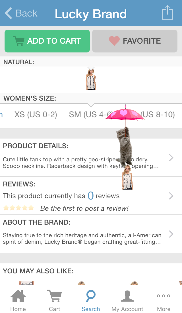
In 2015, we may see more microinteractions that are playful and purely for user delight. I read about microinteractions on iqtv.com several months ago, and they mentioned one microinteraction so cool that I had to try it for myself. On the Zappos app, if you “favorite” an item, a kitten with an umbrella will float across your screen. It’s silly but it makes me laugh. Playful and engaging microinteractions will become more common this year.
Which web design trends do you think will dominate 2015?
