
Design Trends 2016: The Good, The Bad, and The Outdated
As the Internet evolves, it also affects how websites are designed. Think website design as fashion trends, some trends come and go, others become iconic.
It should be noted that just because a shiny new design is a trend, it doesn’t necessarily mean it applies to every industry with a website.
With that in mind, let’s look at some of the newest design trends that are both good and bad.
The Good
Card Layouts
Website card layouts were first made popular by Pinterest a few years back and had increasingly been seen on content-heavy websites. jQuery Masonry can be used to imitate this type of layout style with animated cards for various heights & widths. A great website, besides Pinterest, utilizing this design is TheNextWeb.
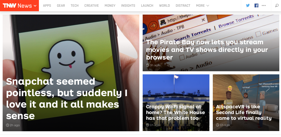
Image Source: TheNextWeb
Flat Design 2.0
Google Material Design represents the evolution of Flat design to Flat 2.0 ideology: the comparison of the material world with the clever play of shadows, light and movement. Material Design gives users visual clues of their interaction with a website. A great example of a website following the Material Design rules is Angular. The Angular logo uses the light and shadow to create dimension.
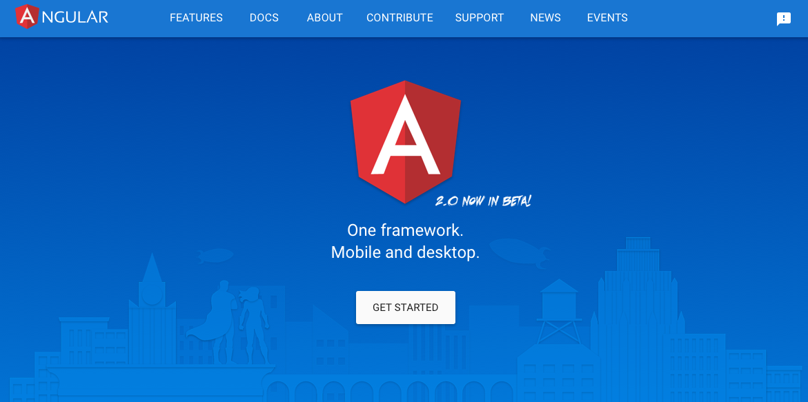
Image Source: Angular.io
Video Design
With desktops and laptops now equipped with high-quality screens such as Retina displays, HD Video backgrounds will be growing in popularity. Faster Internet now available to many and browser support for HTML5 video, will make websites with video backgrounds a popular website design trend grows in 2016. A great example of this is a website we created for Texas' Drupal Camp - TexasCamp 2016.
The Bad
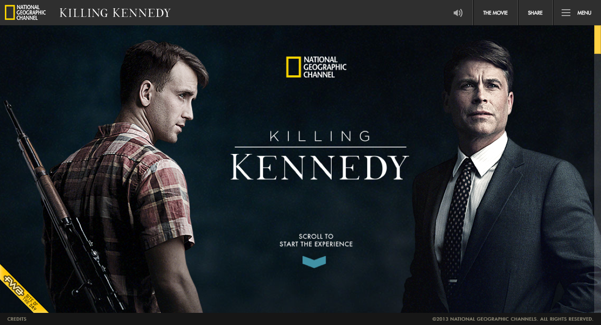
Desktop Websites with Mobile Menus
Anyone involved with web development knows that having a responsive website – mobile first – is key. Google even penalizes websites that aren’t mobile-responsive friendly (see Mobilegeddon). Mobile design has transcended to desktop design regarding the menu. Some websites have made their menu into hamburger menus.
This kind of menu can create a clean look to your website if it is rich in imagery. Most people can usually tell that it is a menu, but if you have dropped downs, i.e.: a mega menu, this design can ultimately hurt you. You might end up with a big bounce rate if people browsing a website with hamburger menu are not aware there’s more to the site.
The National Geographic Channel website utilizes the hamburger menu, as can be seen below.
The Outdated
Carousel Home Pages
For a few years, the big image trend has been taking off, so have big image carousels. This is one trend I would say is “iconic”, however, not unique as many websites happen to have these. Is it time for a change? Maybe, because it has been overdone.
If you are worried about your Google Analytics (you should), Carousels are bad for SEO. How are they bad? Well Google does not use the keywords in meta tags in web ranking . In other words, if those carousels have images with words in them with keywords relating to your website, Google does not even consider that good relative content.
Final note on carousel home pages, it does make a website pretty, if the images are nice.
What do you think about the direction websites are trending to in terms of design? Do you know other trends? Share and comment below!

