A/B Testing – What it is and What to Test
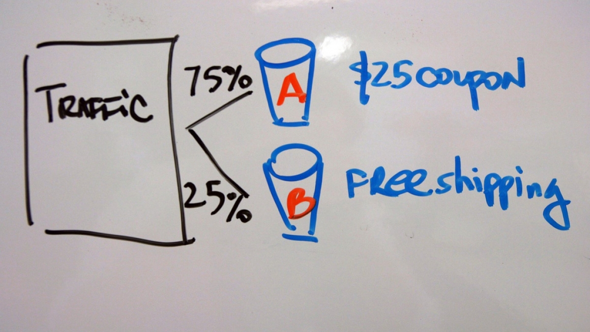
You’ve worked hard to create what you believe is a top-notch website that’s easy to navigate with great content and engaging visuals. But for some reason, the website isn’t quite getting the results you want, and now you’re considering making some changes. A/B testing is an easy way to test changes to your site against the current design to see which ones produce positive results before making those changes permanently. While your team probably has ideas about how visitors to your site will respond to changing certain elements, A/B testing lets you show users two versions of the same page so instead of guessing what they’ll like, you’ll actually know.
The question now is what to test. Our answer – everything. We know that’s kind of overwhelming, so we’ve put together a list of some good places to start.
Copy
Copy is your story and is how you communicate your message to website visitors. Try these ideas to see if they help your audience better understand what you’re trying to say.
- TL;DR. We’ve said it before – “Too Long; Didn’t Read.” Maybe less is more. Try shorter versions of the “About Us” page, services, clients and other content on your site.
- While you’re cutting words, test bulleted or numbered lists versus paragraphs.
- Change up your headlines. Do users prefer straightforward headlines or do more creative versions get their attention?
- Is framing the problem? Framing is the concept that different ways of presenting the same information will evoke different emotional reactions, thus influencing a person’s decision. So test how you frame your copy to see if users have different reactions to positive versus negative messaging.
Calls to Action (CTAs)
You want website visitors to actually do something once they’re on your site, be it purchase your product, share information, or sign up for your newsletter. Changing your CTAs can yield big results.
- How are you asking users to take action? The words you choose could help or hinder their decision. Try changing the text to see which words or phrases get the results you want.
- Hyperlinks versus buttons? Who knows? You will if you try both options to find out which your visitors prefer.
- If your CTAs have only text or only icons, you may be missing out. Use CTAs with text, icons and text + icons to learn which version works the best.
- Move the CTA button. If it’s on the bottom, move it up top and vice versa.
- Give users more opportunities to act by testing multiple CTAs per page against one CTA per page.
Visual Media
Seeing is believing, as the saying goes, so give your website visitors powerful visuals. The right media can influence the way people to act when they’re on your site.
- Is your site easy to read? Test larger type (you know we like it), higher contrast colors, and different fonts.
- If you currently use stock photography, try using images of your employees or customers and see how visitors react.
- What is the first image users see when they land on your site? People or product? Test different images on your landing page and go from there. If your users prefer seeing people, then you can test gender, age and more.
- Do visitors want to see your product? If so, try a static image versus a video.
- If your site has video, test auto-play versus click-to-play to see which attracts more views. You also can try male and female voiceovers for the videos to learn which leads to the most completed views.
Site Navigation
If there is one thing that can drive away web users quickly, it’s faulty site navigation. The navigation menu is the roadmap visitors use to explore your site and determine what is important. Here are some functions to check to ensure your navigation is as smooth and intuitive as possible.
- This is another place where copy is important. Test the titles of your navigation items to be sure users know exactly what they will see when they click.
- Try shuffling the order of menu items in your site navigation.
- How is your navigation bar displayed? Do site visitors prefer a horizontal or vertical orientation? Do they like a navigation bar that moves as they scroll?
When it comes to site navigation, we suggest focusing the test on new versus returning visitors. People who have been to your site before are used to seeing items in certain places. If something is not where they expect it to be, it’s unlikely they’ll try to find it.
Forms
Does anyone really like filling out forms on a website? In many cases it’s a necessary evil, so test the forms on your site to make them as user-friendly as possible.
- Bigger is better (again). Try making individual form fields larger, as they feel friendlier to users.
- Be brief. Test removing non-essential sign-up boxes or relocating them to another page.
- Share the love. A special offer, discount, or promotion can increase sign-ups.
- Spare the spam. Test adding a message that assures visitors users you won’t fill up their inboxes with junk.
Using AB testing allows you to measure the impact of changes, ensuring that every change produces positive results and truly optimizes your website.
Photo credit: ![]() Some rights reserved by mil8
Some rights reserved by mil8

