Responsive Drupal Theming, Done the Right Way... At Least For Now Anyway
A little over a year of following my own advice, I decided to re-visit the long overdue topic of responsive theming and share several valuable techniques and processes I've learned along the way.
[php]if ($attention_span === 'tl;dr') { $summary = $awesome_theme / ($bootstrap + $less + $display_suite); }[/php]
Responsive Framework
The most important part of any toolkit is probably going to be the theme framework you'll use. Omega, hands down, claimed this crown for me in 2012. Packed with an amazing amount of flexibility and features, there wasn’t much I couldn't do with it. Towards the end of the year, however, I found myself feeling like I was fighting it more than working with it. Granted, this issue probably stemmed from my “need-something-new” itch. Alas, I gave in and decided to really dig and see what other frameworks existed... and not just in Drupal either.
To Google, I did go. Searching for "responsive frameworks", I came across this kick-ass article by Ben Gremillion from Treehouse Blog: A Look at Responsive CSS Frameworks. He gives a pretty darn good breakdown of the pros and cons on many of them.
My decision? Drum roll...
Tickle me spring green and call me mobile, [Twitter] Bootstrap claimed the 2013 framework crown! So it wasn’t really that dramatic of a decision, but here are a few of the many reasons I decided to go this route:
- Co-created by Mark Otto, Designer at GitHub and previously the Web Platform Designer at Twitter. This, like Ben said, gives me a little more ease knowing that this a rather solid framework that is used by millions of people already.
- Extensive documentation. No need to drudge around some new framework that “looks” awesome but really hasn’t had the time to be properly documented. Someone has to have time to play the laser pointer chasing game with my cats.
- Based in the LESS preprocessor, which, for me, has a far simpler syntax than one like Sass. Many people can argue this until their hairline recedes, but ultimately I would consider using Sass for more powerful things like actually creating the framework rather than just a simple sub-theme. For sub-theming, it’s nice that I don’t have the overhead of @includes and @extends everywhere.
- Built-in 12-Grid system, Base CSS, JavaScript Plugins, Components...... and the kitchen sink, what more do you want?
- Wasn't really necessary, but glad to know that there is already a project on Drupal: Bootstrap. Albeit, this probably needs some fine tuning, but still a nice surprise. Ehh, who am I kiddin? "There's a module for that".
CSS Preprocessor
This is probably the next important tool in your responsive arsenal. No, it’s not actually necessary to get the job done, but by golly it certainly speeds up the process! Now any preprocessor will do and you can generally find a GUI or CLI program for any operating system.
For those of you who use Macs though, have I got an app for you! CodeKit — THE Mac App For Web Developers. It is, by far, the best program I have bought in a LONG time! Not only does it preprocess LESS automatically, but also Sass/Scss (with even Compass and Bourbon built-in), Stylus, JavaScript, CoffeeScript, Haml, Jade, and Slim. Oh and the frequent updates are nice too!
[[{"type":"media","view_mode":"media_original","fid":"31189","attributes":{"alt":"","class":"media-image","height":"564","style":"display: block; margin-left: auto; margin-right: auto;","typeof":"foaf:Image","width":"891"}}]]
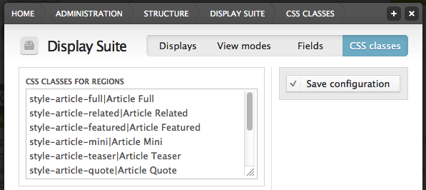
LESS Media Query Mixins
I found this useful technique that guided me down the road to creating my own that I use quite frequently through out my projects. This allows for a much easier implementation for responsive design. It also allows me to keep styling together and keeps the code pretty clean. No more additional files, no more separate definitions, it just works!
@mobile: ~"all and (max-width: 767px)";
@tablet: ~"all and (min-width: 768px) and (max-width: 979px)";
@normal: ~"all and (min-width: 980px) and (max-width: 1199px)";
@wide: ~"all and (min-width: 1200px)";
.style-article-featured {
  width: 100%; // Mobile first
  @media @tablet {
    width: 80%; // Tablet
  }
  @media @normal, @wide {
    width: 50%; // Normal & Wide
  }
}
Display Suite: Layouts & Classes in Harmony
Many of you are probably already familiar with Display Suite. Until this module came along though, implementing consistent styling through out a Drupal site presented its challenges. Often times, more than not, areas of the site (like node templates or views) had to be constructued to "match" the theme. Because of this, I think it's relatively easy for us to be stuck in the mindset that we should be letting these other modules handle our structuring (and even sometimes styling) of entities or other data.
So I tried a little experiment. No node templates, no fields in views, just render the entity with a desired layout. To my complete and delightful assumption, Display Suite worked like a charm! Let's take it a step further, create custom layouts for the content types. These, of course, should probably be based off the theme and should be predetermined before you actually start theming or building your site.
Now, you could use the existing classes that come standard with rendering an entity (which include the layout name), but I prefer to create my own region classes in Display Suite. It allows for a cleaner approach in the CSS so I don't have to target multiple classes. Either way, matching an entity's layout classes with your themes CSS is where the power and magic really starts to happen.
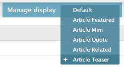
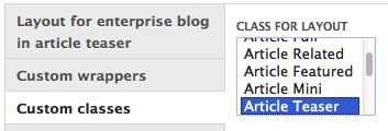
Display Suite Concept Example
Take our site here, this blog you're reading. We have six different layouts for this content type. We use these different layouts through the site and each have their own unique theme stylings. For each style, I created a custom layout with a matching CSS selector. In this example, I will use our Article Teaser layout:
In the Display Suite classes admin area (left image), I added [code]style-article-teaser|Artical Teaser[/code] where the text on the left of the pipe is the class name and the text on the right is the human readable label. Once my classes were setup, I headed over to the content's "Manage display" configuration form (top right image). From there, I chose my "Article Teaser" layout and scrolled to the bottom where I selected the "Custom classes" tab (bottom right image) and chose the appropriate class region for my entire layout.
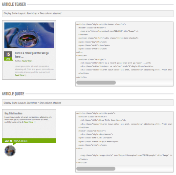 You may wonder, "What does this have to do with responsive?" Actually proably more than you might think. Whenever I start a new project, I like to create an internal style guide that shows the rendered element and the required markup (complete with internal classes). I do this for three reasons:
- Helps the developer build things the right way, markup wise and inserting classes where necessary.
- It provides a single place to view both generic/site-wide elements and layout specific elements.
- In addition to above, I can then resize the window and view all these elements and how they react to responsive media queries.
Ta-ta-ta-da! Fewer one-off styles or pages that aren't responsive. It just works! Granted, you'll still have a few pages that you might need to tweak, but you're going to be far better off with only a few and not all!
Overall, responsive theming can be a daunting task, to say the least. But if you're willing to get a groove goin', things can speed up pretty nicely. Hopefully some of these techniques and processes I've discovered will help aid you in your troubles. Also, feel free to let me in on some of yours down below in the comments!
Photo Credit: jiraisurfer