Website Trends 2013: Flat Design
Have you been noticing that some of your digital interface designs are becoming more "flat" in nature? The flat web design trend is making its way around the web, and I'm not about to complain.
What do I mean when I say "flat web design"? This web design trend favors a simplified, classic style opposed to a more realistic, drop shadow and texture-heavy design. In theory, flat design should simplify the user experience by creating a clean interface with a digital feel. I personally like the trend because it is a change of pace from other sites that strive to create more of a 3D look. Something about the simplicity of a flat design keeps me focused on content, while still feeling pleased by the site's esthetic.
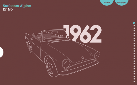
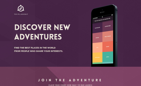
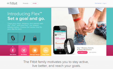
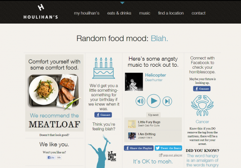
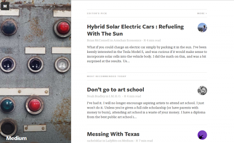
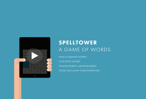
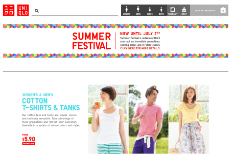
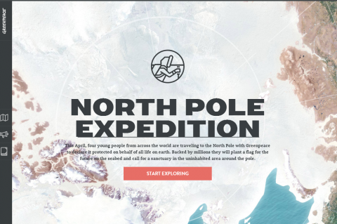
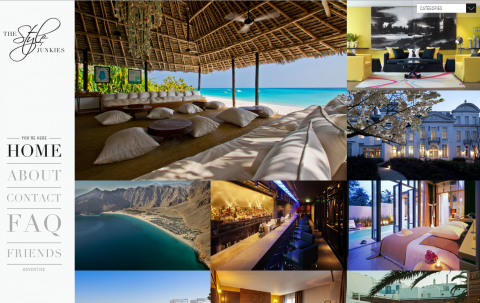
Below are some examples of sites that use flat design.
What are your thoughts on the flat design trend? Let us know in the comments below!
