How Adobe Comp CC App for iPad Helps the Non-Designers
As a digital marketer, sometimes I sit and think about what I wished a website, landing page, or email template should look like regarding marketing campaigns. As much as I'd like to think that I can design and site build, there are limitations on what I can do, such as theming. Have you ever tried and struggled to describe to a web designer or even a developer how you feel a web page or email template should look like? I know I have. They need more direction than a simple, make it modern and make it pop with big images. Yes, that's very helpful to them (note the sarcasm), and sometimes it's what clients tell their agencies when they want a redesign.
Well, I found a solution to express ideas that can then be translated into terms that a themer, developer, or a web design agency can understand. I'm talking about the Adobe Comp CC App for iPad. You will need an Adobe subscription for you to use this App on you iPad. There are some limitations if you don't have both an iPad or subscription. However, you can take advantage of the 30-day free use of the Adobe App to test the Adobe Comp CC App.
Alternatively, you can also use UXPin, a web based easy to use wireframe and prototype platform. We use UXPin here at LevelTen, and our team finds it easy to use. There is also a cost, but it is relatively inexpensive.
Creating Your Vision
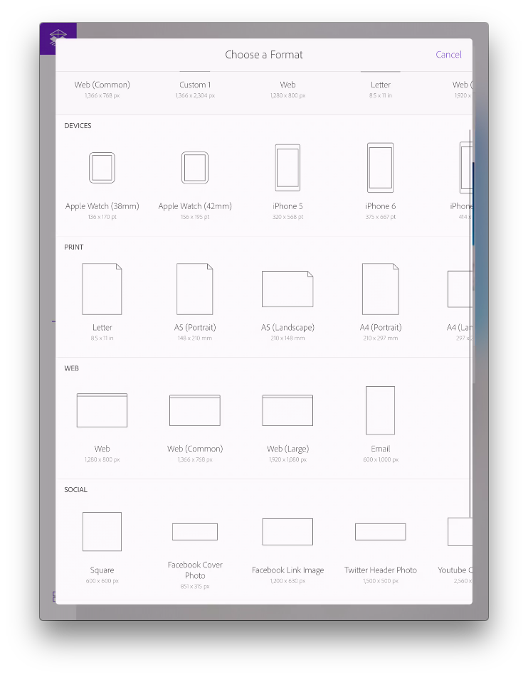
When opening the Adobe Creative Comp App, you will notice that it features a lot of predetermined sizes ranging from devices, social media templates, web design, and print. Although you are given all of these sizes, you can still make your own custom sized template.
Learning Drawing Design Gestures
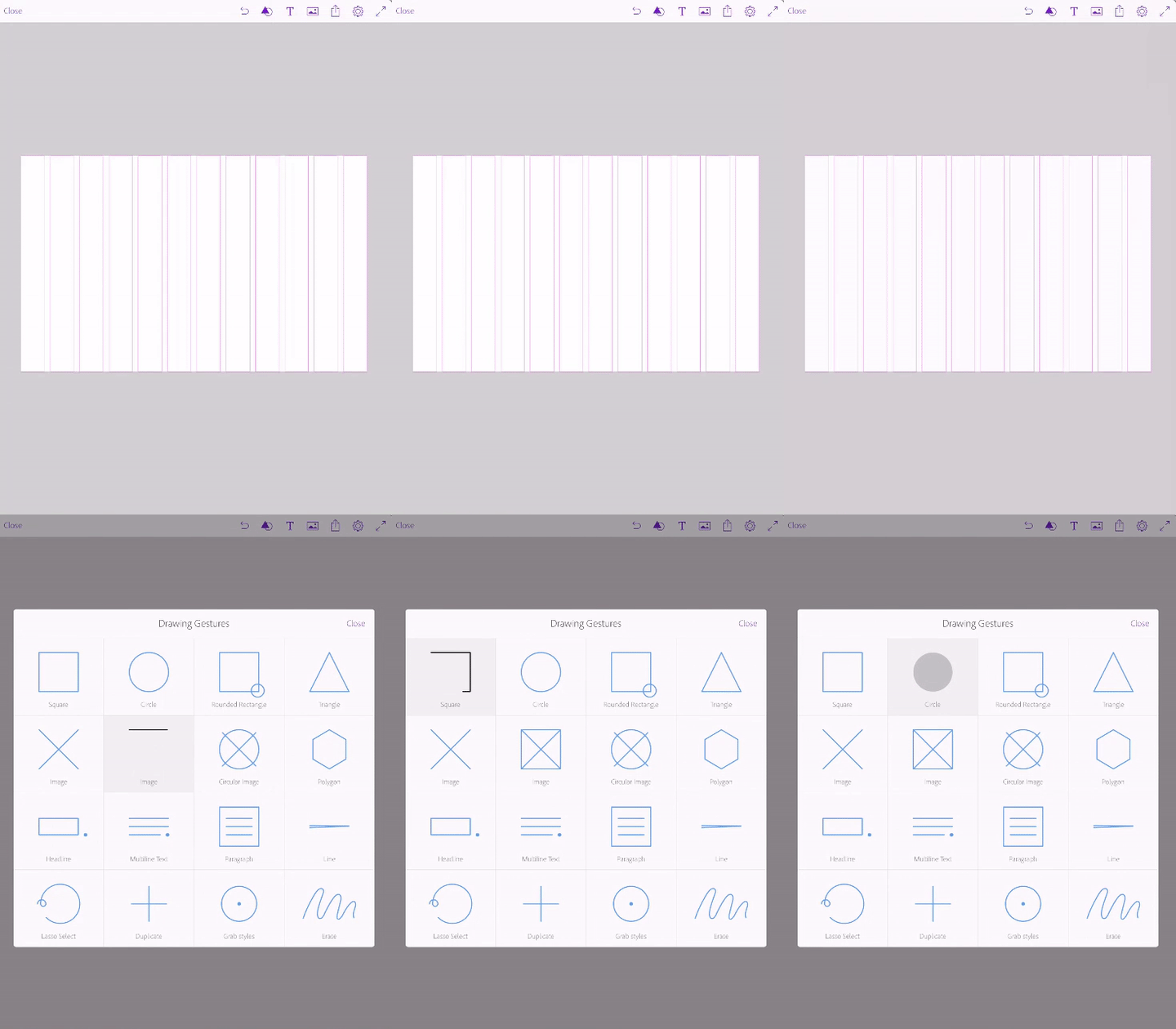
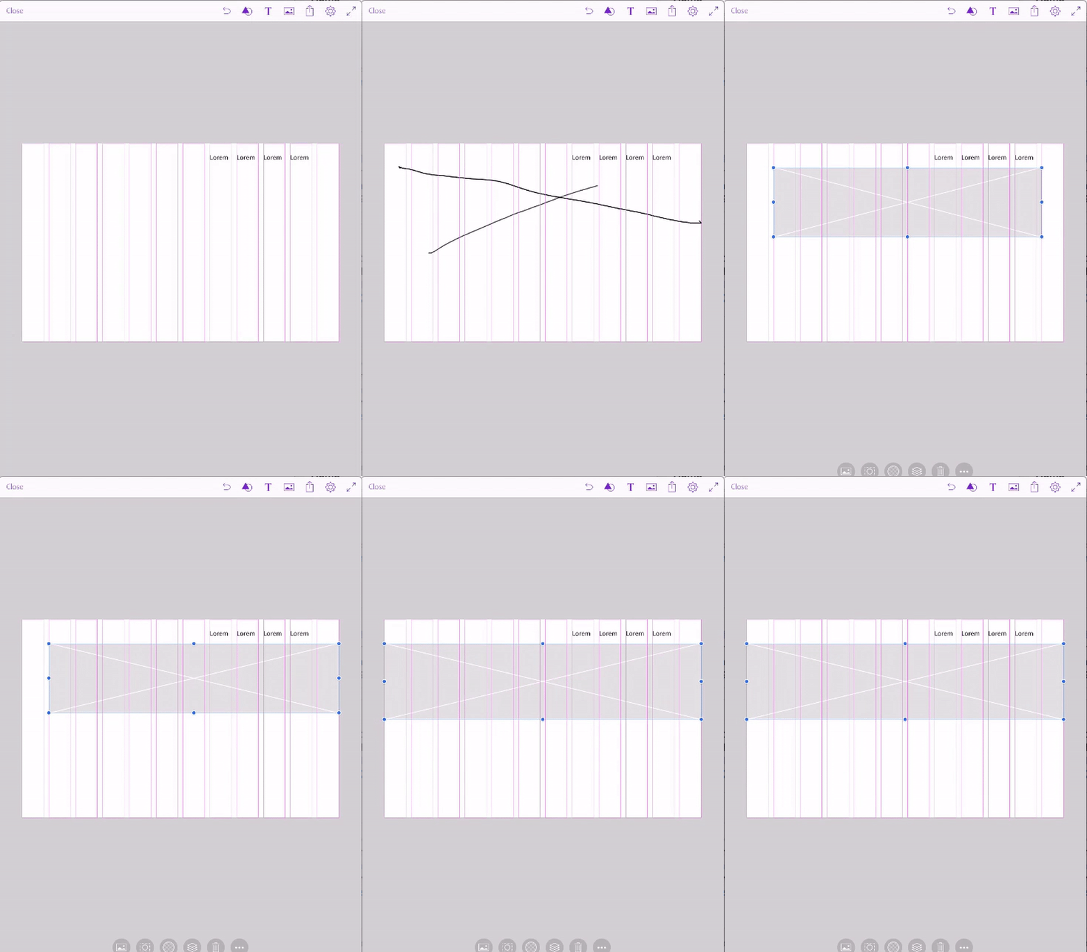
Drawing Gestures are by far, is the most fun feature of the app. You can be the worst illustrator in the world, and the app can translate it into something great. I can't draw perfect circles to save my life, but the app will make it look I can. The drawing gestures are very simple. For example, a box with an "X" in the middle, actually translates to an image, just like a wireframe would typically display one. Three lines and a period indicates lorem ipsum text. Don't worry if you don't know all of the gestures before you get started, because just under the cogwheel, you can find a quick guide to all of them.
Adding Grids to Your Design
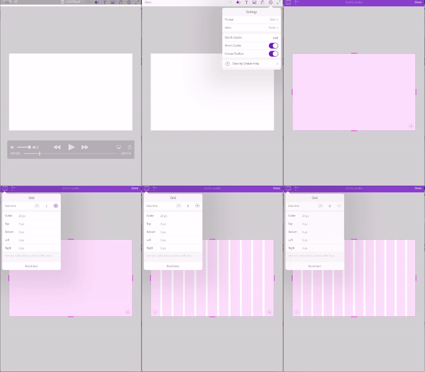
You're probably wondering what in the world grids are, that is, if you never actually delve into the world of web design. Luckily, after working at LevelTen for a little over two years, I have learned how websites are designed to be responsive, and this is by utilizing a 12 grid-view because this makes it easier to place elements on a page. Want to learn more about it? W3schools is a great source.
In the meantime, here is a screen shot of how to add 12 grid columns on to your comp prototype.
Adding a Menu, Hero Image, Icons, and Text
We all see websites and landing pages with big images when you first arrive and of course, we want that. It's the latest and greatest, and it's pretty (avoid telling website builders this). You can now demonstrate to the web design team what you mean and want by "I want a big image." For the record, it's called a "hero image."
Adding a Menu
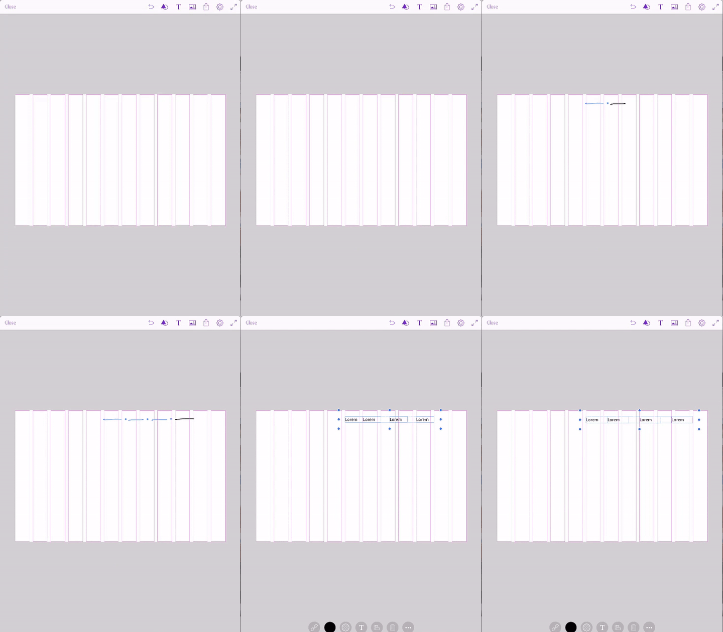
To add a menu to the top of the website comp, all you have to do is draw a line and a period. In this case, I drew four lines for a four menu item.
You can also adjust where the go on the page according to the grid structure. Notice that the App automatically gives you additional grid lines so you know your items are aligned.
Adding a Hero Image
Drawing an "x" across the screen and expanding it to go full-width will provide you a placeholder for a large image. You can see this below:
Adding Icons
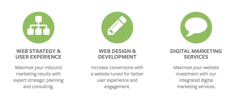
Sometimes on websites, you see icons that demonstrate the different types of services that are offered. We have icons our website like these:
With the App, you can draw circles; you can see mine are not perfect in any way, and they are translated into circles for future icons.
![]()
Show where you Envision Text or Paragraphs
Now that you have added images and icons on your website comp, the next important thing to add is content. As marketers, we know content is king. You might not have the content when you imagine what your website, landing page, email template, etc., but it doesn't mean you can display where it will go eventually.
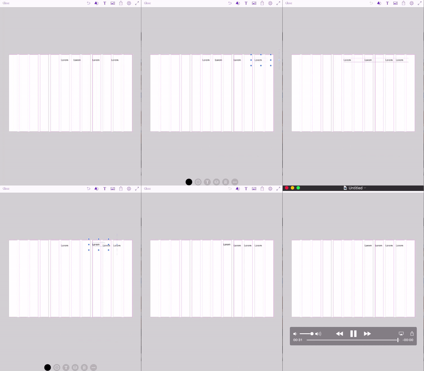
Below you can see I use the drawing gesture of 3-lines and a period to indicate where I want or need text to go. Adobe Comp CC uses lorem ipsum as filler text when utilizing this draw feature. In the video at the end of this blog post, I demonstrate how you can change the filler text to real content. For now, here is how to add your example text.
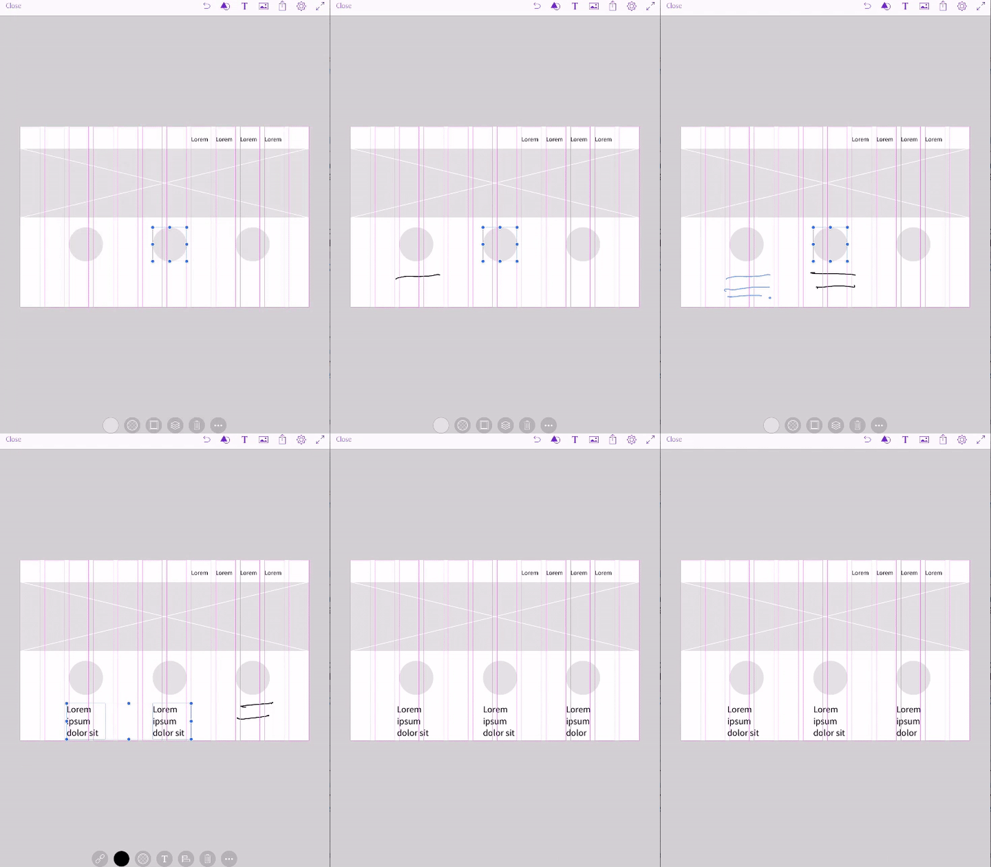
Adding an Image
Now that you have a base for your website comp, you can add images directly from your library or the Adobe Stock library. I had a previously saved image in my library that I added to the comp. I show how to get images in the video at that end of this blog post.
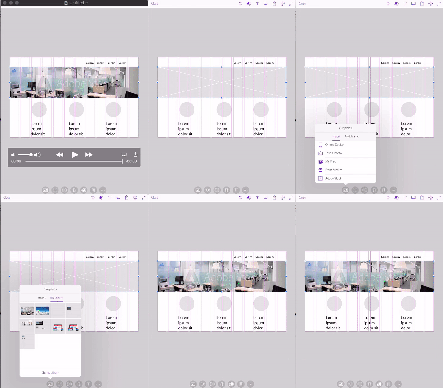
Get it to the Real Web Designer
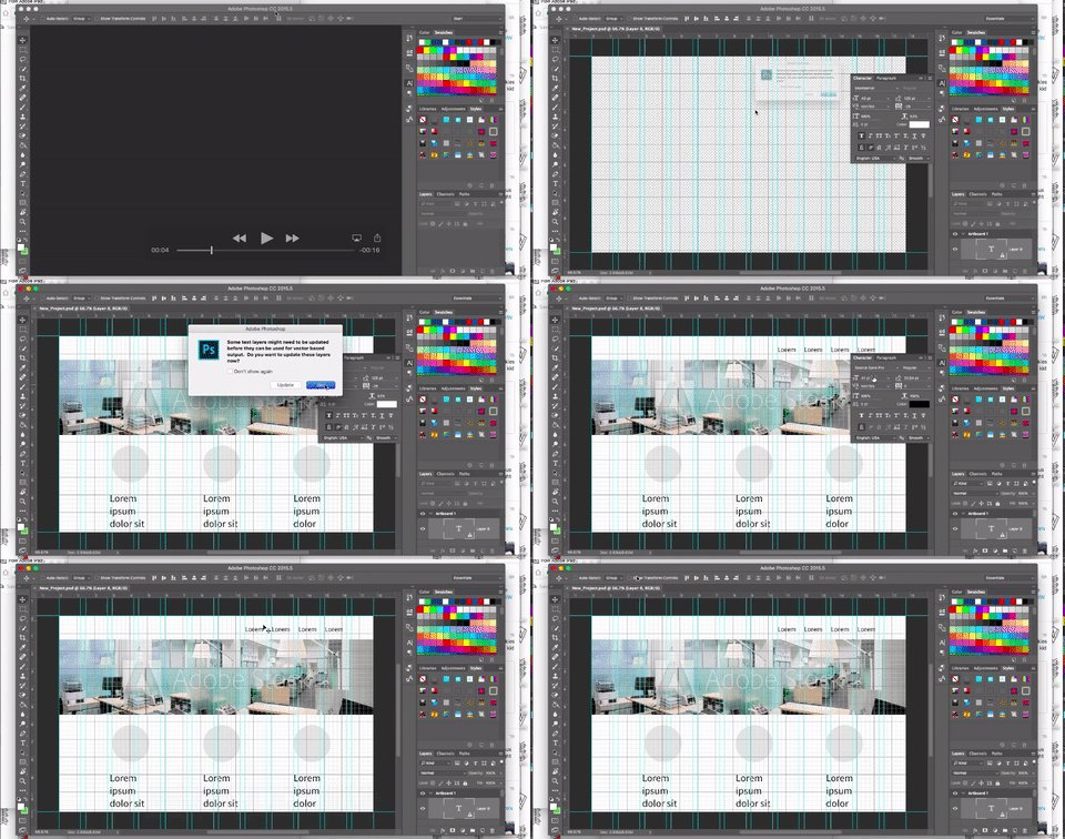
You have your neat visual sketch ready to go. Maybe some elements can't be reproduced or not placed in the right place, but now you can hand something off to the real web designer and let them do their magic. Exporting your work is incredibly easy, as long as your iPad is connected to the internet. You can send your work to InDesign CC, Photoshop CC, Illustrator CC, Muse CC, Auto Mockups, convert it to a PDF, Image or only share the link. You can see how easy it is to get it from your iPad to your desktop Photoshop CC. Save the document as a PSD and email or ping it to your designer. Easy peasy.
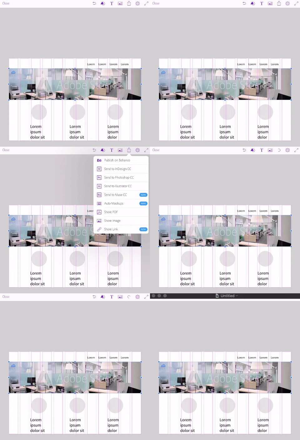
All design assets are put into separate layers, so it's easy for designers to see the elements.
Now go and have fun creating website comps, email templates, social media graphics, etc.! Say goodbye to the days of paper and pen sketching design ideas.
DISCLAIMER: This by no means replaces the graphic designer in the process of designing websites, this is merely a way for a non-designer to design an armature prototype of their idea. If you're looking for a website redesign, this might be a great way to express your vision for a website, but leave it to the real web designers to make it real, "pretty" and functional.
Below is the 10-minute live recording of me creating a homepage comp and an email template. Be sure to check it our in 4K (UltraHD)!
