Why You Should Use an Infographic
And why you should consider an infographic in your marketing strategy.
Recently, in this modern era of the Internet, the rising popularity of using infographics has been leaving an impression in the minds of users everywhere, and for good reason. If a picture is worth a thousand words, how many hits do you think it'll get online? An infographic is a visual representation of data, information, or knowledge. Of course this could translate into numerous things, but it shows the vast potential for what an infographic could represent. They are considered an invaluable tool for marketing and PR buffs alike, but only if used correctly.
Infographics are more than just pretty pictures with big words on them, they're a way for us to help manage information overload. They take a large amount of data and break it down into smaller, digestible chunks in a visually pleasing way. Most of us remember images better than text. When was the last time you remembered a page in a book over an image on a billboard or commercial? Infographics don't require large amounts of text to read, or the time investment and sound requirement to watch a video. So, what are some reasons why you would choose to use an infographic?
- Spice up a relatively boring topic by using appealing images to engage users' attention.
- Stretch those marketing muscles and blend in your company logo and slogans for an aggressive approach to branding.
- Interesting new graphics will better portray the slate of information you have.
Looking back at the third point, this goes along with the saying of, "Just because you can, doesn't mean you should." Not all data is suitable for infographics, so be sure to understand and recognize who the audience is and then keep the content relevant and engaging for the reader. It's not fun and exciting, but sometimes it's just best to use a bar chart. You're probably wondering, "But alas, how can I make an infographic?" I've compiled a few simple tips from HOWDesign (HOWDesign: Creating Infographics) to help you bend that data to your will.
- Determine your main ideas and stick to them. Try and keep the text to a minimum, or else you might as well author a picture book.
- Once again, know your audience and keep the design relevant. If you're designing an infographic for stock traders, don't point it at programmers or web designers.
- KIS - Keep It Simple. Filter through your large amounts of data to gather the main points and organize it so the infographic doesn't boggle your reader. Keeping it simple allows your infographic to be easily read and understood. This is key to a excellent infographic.
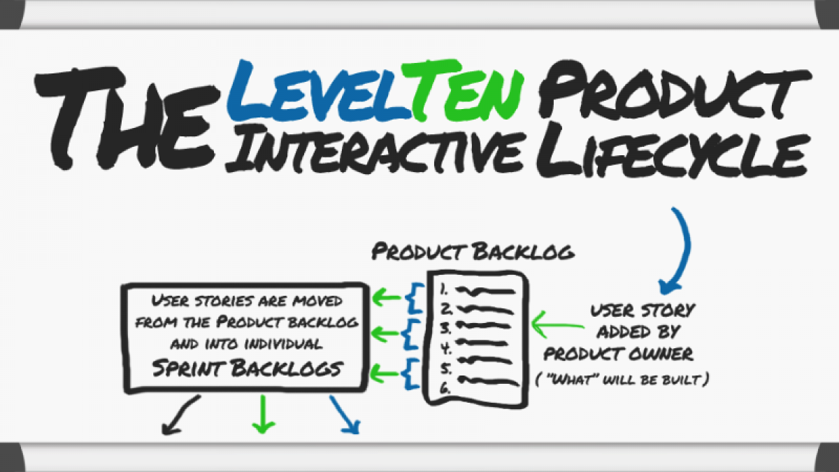
Feel free to check out the full scale LevelTen Product Life cycle Infographic. Care to take a crack at an infographic? Share it with us in the comments below.

