Drupal 8: Marketer Friendly
The digital marketing world keeps changing, basically every day, or whenever Google decides it’s time to change their algorithm. As a person who practices digital marketing, I know the challenges of working with a CMS and the need to for it to allow me to publish blog posts (like this one) easily and have it be mobile responsive, because who uses actual computers these days?
Content marketing isn’t a fad, it’s happening, right now. I’ll be honest and say sometimes working with Drupal makes it challenging when adding content. However, working with Open Enterprise, a Drupal distribution makes it a lot less complicated, especially for someone who is not technically inclined and has limited coding experience.
That being said, the announcement of Drupal 8’s features and what it has to offer seems like Drupal is making a conscious effort to make it easier on the everyday marketer.
According to the Drupal.org website:
Drupal 8 allows marketers to:
- Use the marketing software you already know.
- Build campaigns with mobile in mind.
- Add, remove or revise content simply.
- Easily deliver content segmented by audience, language and device type.
Out of the many features Drupal 8 offers, my favorites would have to be the improved WYSIWYG that now comes inline images and responsive images. As well as the admin menu, which I'll get into later.
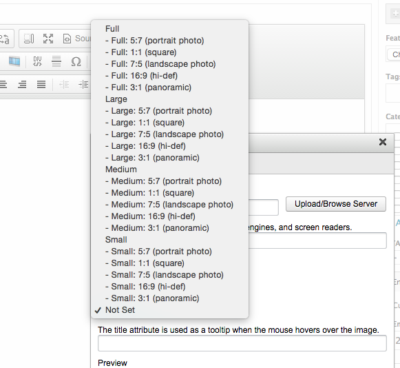
It's great to know how small or large you can make the image and the options of making them align. I should note that Open Enterprise CMS already has this feature built into the WYSIWYG. It's really great that it is now going to be a standard feature in Drupal 8. Open Enterprise CMS' image upload and size configuration looks like this:

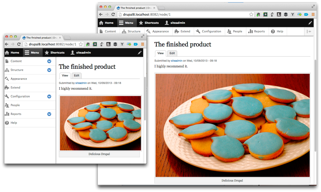
Responsive images in the WYSIWYG also make the content marketer see how their images will be seen on mobile. From the example given by Acquia, see picture below, it looks like images can be tested for responsiveness by "resizing the browser" (which we affectionately call 'twerking').

A feature in Drupal 8 that might not be something you think about is the look of the admin menu (see admin menu above). You're probably wondering why I like the admin bar, well, I also work with WordPress CMS. So, if you have clients that are looking to move from WordPress to Drupal sometime in the future, this nav bar will help with the learning curve of finding menu items. It looks very similar to WordPress' admin "dashboard" menu. [Note: I've been creating content on Drupal 7 sites for over a year, so I have no problem with admin menu now, but it was confusing at the beginning. There was something about the menu being on the top of the page rather than the side that threw me off. Before working on Drupal CMS, I exclusively worked on WordPress sites.]
What are some of the new elements you all are looking forward to when Drupal 8 releases? Let me know in the comments!

