5 Must Have Landing Page Elements
Everyone knows that a landing page is one of the most important elements for lead generation in the inbound marketing world. According to HubSpot, landing pages have a 5-15% conversion rate on average. You might know that you need a landing page; you might know that they are important for generating leads, but do you have the must-have elements on your current landing pages? Follow these five must-haves and you could start converting more visitors.
Have an Eye-Catching Headline
The first thing a visitor sees on the website is the largest text on the page. So it would make sense to have an informative and eye catching headline to inform your audience what you are trying to offer. Try to keep the headline to less than twenty words, but preferably ten words, most people stay on a page for no longer than 15 seconds unless they are really interested.
Have a Dominant Call-To-Action
In a previous post, we wrote Four Tips for Calls-To-Actions, where we gave tips for creating an enticing call-to-action by using great writing copy and visually appealing and eye catching button. Read more about it here.
Remove The Website Navigation
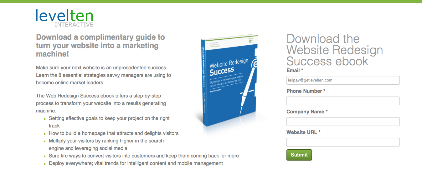
This one might sound strange, however, you want the sole attention of your visitor on the landing page. The last thing you want is for the potential lead to stray away from what you are trying to inform them of. With the low attention that visitors already have towards reading web pages, removing the navigation will help them stay on the page longer and possibly allow for a higher conversion. See the example of one of our landing pages below:

Notice how our landing page looks just like our main site, however, the navigation menu at the top of the page is missing. You, as the reader, are drawn to the large text and the image (which will be our next point) and the very direct CTA on the right.
Have an eye-catching image
As you see in the image above, as a reader, you are drawn to the image in the middle of the landing page. Not only is the image of the book relevant, but also a prominent feature. The large image demands attention, as well as the color, so be sure to add this element to your landing page, especially above the "fold".
Have a testimonial
Have a product you are selling? Wishing that visitors would request more demos? Then you need to add testimonials to your landing page. This could possible convert more visitors in to leads. More and more people rely on reviews when purchasing products, such as websites from Yelp and on Amazon; why wouldn't you want to post reviews of your product for others to read and perhaps become interested? Not only could this lead to requesting more demos, but a possible buyer conversion.
Do you have any other must-have elements to add to landing pages? Will you be changing yours now that you've read some of these tips? Let me know in the comments below!

