How to Create a Successful Email Marketing Campaign
The age of personalized marketing has reinvented the email game for companies across the globe. According to The Radicati Group, there will be 4.9 billion email accounts by the end of 2017. Naturally, everyone wants a slice of this pie. Unfortunately, you can’t market to 4.9 billion people, but what you can do is segment your best opportunities for conversion, and then create a seemingly personal email to appeal to your chosen target.
Let’s go through an example from one of my favorite stores, Urban Outfitters, and see how they did on the four main components of email marketing: Subject Line, CTA, Content, and Mobile Optimization.
Ex. Urban Outfitters
Subject Line:

This is arguably the most important part to consider. If your subject line stinks, people aren't going to open it. As a result, all of the work you put into crafting your email marketing campaign becomes irrelevant. In fact, according to HubSpot, 33% of people open emails because of the subject line, while 69% of people report emails as spam based on the subject line alone.
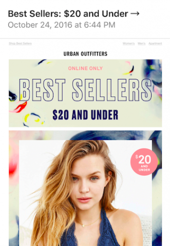
The subject line for this email declared “Best Sellers: $20 and Under →”. It’s short, sweet, and to the point. Email marketing authority, MailChimp, recommends a subject line of 50 characters or less for maximum efficiency. This strategy keeps all of the words visible in the inbox.
If you are a fan of both Urban Outfitters and great deals, then this email appeals to you on a personal level. As a result, Urban Outfitters has successfully persuaded you to open the email and possibly make a purchase decision.
Just like with everything else in marketing, you have to differentiate yourself. Make sure the subject line is unique, personable, and worthy of opening.
Call to Action:

In this example, Urban Outfitters clearly recognizes the time constraints it may have in order to make an impression on its audience. The above-the-fold content is captivating and straight forward: a carousal of women's products stamped with their $20 and under offer and a clear CTA button “Shop Women→”. As you can see, the button color contrasts with the rest of the add and the arrow design consistent with its subject line. From a design standpoint, this CTA is doing all of the right things. If you are having trouble perfecting the CTA button design, email marketing always presents a great opportunity for A/B testing.
Content:
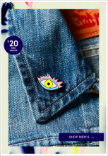
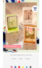
Below-the-fold, the add shows a spread of additional under $20 items for men and for your apartment. Each picture act as a CTA in themselves since they link directly to the corresponding product page.
Finally, at the bottom there’s a reminder of their unique value proposition of free shipping on orders over $50 and free returns. It’s accompanied by social sharing signs, which is important as click through rates for emails with social sharing buttons see an increase by 158 percent.
Mobile Optimization:
Mobile optimization for email marketing campaigns have become increasingly important. Out of Gmail’s 900 million active users, 75 percent report opening their email on a mobile device. The screenshots in this example was actually taken from my smart phone. It should be noted that the desktop version of this email looks essentially identical. Thus, showcasing the ad’s consistency and mobile responsiveness.
There you have it: a couple of small tidbits on how to create an effective email marketing campaign. As long as you are always keeping your target audience in mind, and follow the guidelines given above, you should expect promising results.
Want to learn more about email marketing? Check out some of this recent email marketing blog for more useful tips on crafting a great email marketing message!


